
Bar Plot: Meaning, Types, Examples, and How to Make One
Learn what a bar plot is, explore major bar plot types, see real examples with data, and understand how to create and read clear bar charts
Bar Plot: Meaning, Types, Examples, and How to Make One
A bar plot is one of the clearest ways to compare categories. It uses rectangular bars, and the length or height of each bar shows the value linked to that category. Because the picture is simple, the reader can quickly see which category is larger, smaller, stronger, weaker, or close to the rest.
This updated guide goes further than a basic definition. It uses sample data and shows a plot for every main bar plot type covered in the article. You will see when each chart works best, what the numbers mean, how to avoid misleading design choices, and how to build your own chart in common tools. All sample data in this article are illustrative and are used only for teaching.
In this guide
- Bar Plot Basics, Purpose, and Core Features
- What Data a Bar Plot Can Show
- Main Types of Bar Plots and When to Use Them
- Data and Plots for Each Main Bar Plot Type
- Bar Plot vs Histogram and Other Similar Charts
- How to Make a Bar Plot by Hand or with Common Software
- Design Rules for Accurate and Easy-to-Read Bar Plots
- Common Mistakes, FAQs, and Final Takeaway
Bar Plot Basics, Purpose, and Core Features
The main job of a bar plot is comparison. Each bar stands for a category, and its length shows the size of the value for that category. The reader should be able to look at the chart and tell which categories are highest, lowest, close together, or far apart.
A strong bar plot has a category axis, a value axis, a clear baseline, readable labels, and a title that says exactly what is being compared. When more than one series appears in the same chart, a simple legend can help. The visual design should support the numbers rather than distract from them.
Core features of a clear bar plot
- Bars should have equal width.
- Spacing should stay consistent across categories.
- Bar length should match the size of the value.
- The value scale should be easy to read.
- A common baseline helps the reader compare lengths honestly.
- Labels should be short, direct, and easy to scan.
What Data a Bar Plot Can Show
Bar plots are most useful when at least one variable is categorical. The category might be a support channel, a school subject, a U.S. region, a product line, or a survey choice. The bar height can then show a count, a percentage, an average, or another summary value.
Counts and absolute frequency
A count shows how many observations fall in each category. If 84 customers use web chat and 18 visit in person, a simple bar plot can display those counts directly. This is often called absolute frequency.
Relative frequency and percentages
Sometimes the share matters more than the raw count. In that case, the value can be the percentage of the total instead of the total itself. Percentage bars are useful when you want to compare composition across groups of different sizes.
Mean values and error bars
A bar can also show an average. In that case, the chart often benefits from error bars, which give more context about variation or uncertainty. The reader should always be told what those error bars represent, such as a standard deviation or a 95 percent confidence interval.
Table 1. Average wait time example
| Channel | Mean wait time in minutes | 95 percent interval |
|---|---|---|
| 6.4 | ±0.8 | |
| Phone | 8.1 | ±0.9 |
| Web chat | 4.9 | ±0.6 |
| In person | 9.3 | ±1.1 |
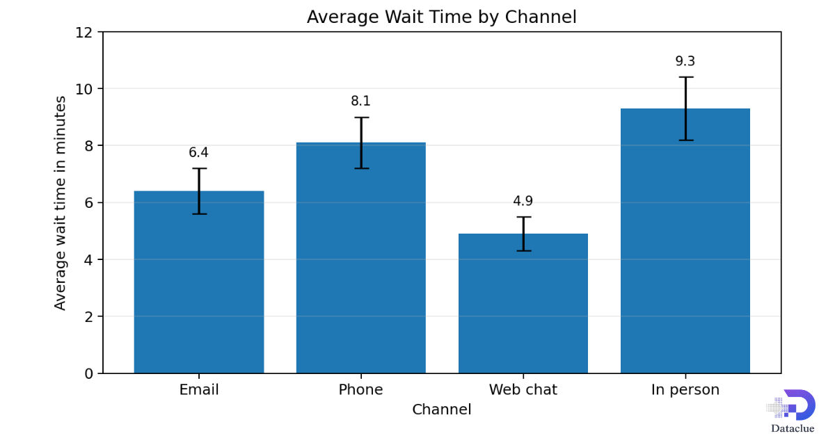
Figure 1. Bar plot of mean values with error bars.
In this chart, in-person support has the longest average wait time, while web chat has the shortest. The error bars show that the averages are estimates, not exact points with no uncertainty.
Main Types of Bar Plots and When to Use Them
There is no single bar plot for every question. The best type depends on whether you want to compare one value per category, several values in the same category, parts of a total, or values above and below a reference point.
Table 2. Main bar plot types at a glance
| Type | Best use | Main strength | Main caution |
|---|---|---|---|
| Simple vertical | One value for each category | Very fast to read | Can feel crowded with many categories |
| Horizontal | Long category labels or ranking | Easy label reading | Takes more vertical space |
| Grouped | Direct comparison across series | Precise side-by-side comparison | Too many series create clutter |
| Stacked | Totals plus component parts | Shows total and composition together | Middle segments are harder to compare |
| Percentage | Composition across groups | Each group is easy to compare at 100 percent | Hides raw total size |
| Deviation | Values above and below a reference | Shows direction and size of change | Needs a clear zero line |
| Broken scale | One outlier far larger than the rest | Small values become visible | Must be marked clearly to avoid confusion |
Choosing the right type
Use a simple vertical or horizontal chart when each category has one main value. Use grouped bars when two or more series must be compared directly. Use stacked bars when total size and parts both matter. Use percentage bars when the share within each group matters more than the raw total. Use deviation bars when the key question is how far a value is above or below a reference point. Use a broken scale only when there is a strong reason and the scale break is clearly marked.
Data and Plots for Each Main Bar Plot Type
This section shows a separate data example and plot for each major type. The goal is to make the choice easier in real work, not just explain the names.
Simple vertical bar plot
Table 3. Customer inquiry counts by contact channel
| Contact channel | Number of inquiries |
|---|---|
| 72 | |
| Phone | 55 |
| Web chat | 84 |
| Social media | 31 |
| In person | 18 |
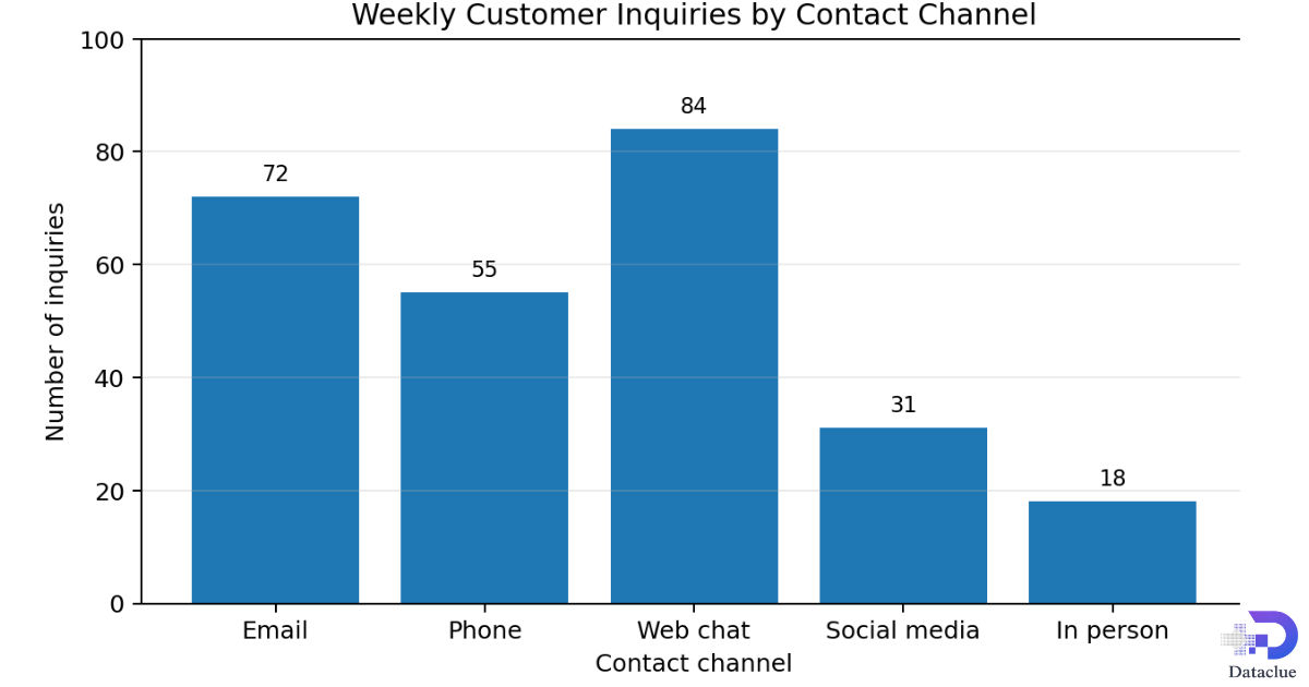
This is the classic bar plot. It works well because each contact channel has one value, and the labels are short. The chart shows that web chat leads the group, followed by email.
Horizontal bar plot
Table 4. Average resolution time by support request type
| Request type | Average resolution time in minutes |
|---|---|
| Password reset requests | 8 |
| Billing correction requests | 14 |
| Shipping update requests | 11 |
| Account setup questions | 17 |
| Technical support cases | 26 |
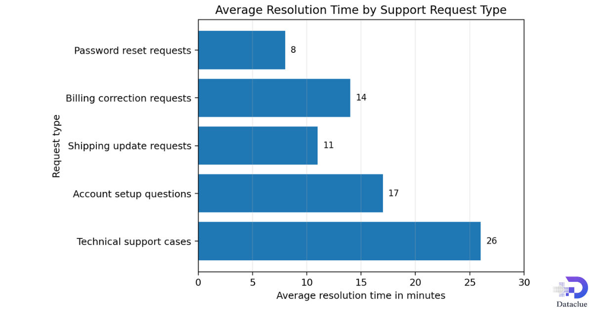
Figure 3. Horizontal bar plot example using long category labels.
The horizontal form is better here because the labels are longer. If the same labels were placed under vertical bars, the chart would be harder to read.
Grouped bar plot
Table 5. Quarterly orders by U.S. region
| U.S. region | Actual orders in thousands | Target orders in thousands |
|---|---|---|
| Northeast | 84 | 80 |
| Midwest | 71 | 75 |
| South | 96 | 90 |
| West | 88 | 92 |
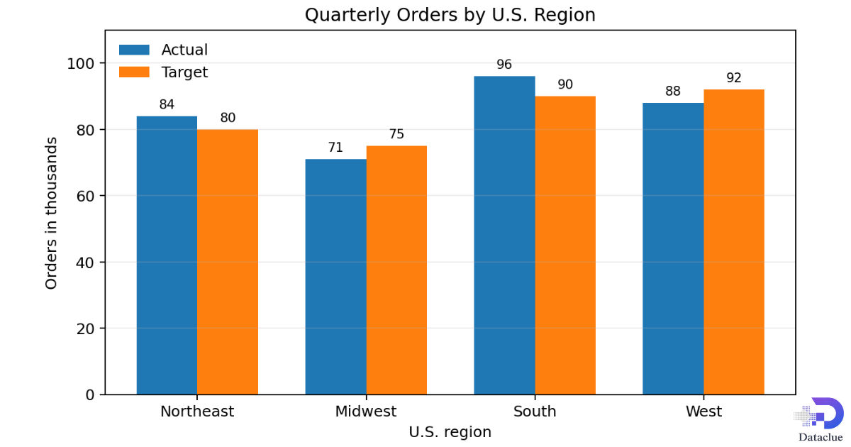
Figure 3. Grouped bar plot example for direct comparison across U.S. regions
Grouped bars are best when each series must be compared directly. In this example, you can quickly see that the South is above target by 6 thousand, while the Midwest and West are below target by 4 thousand each.
Stacked bar plot
Table 6. Order mix by U.S. region in thousands
| U.S. region | Mobile | Desktop | Store | Total |
|---|---|---|---|---|
| Northeast | 30 | 34 | 20 | 84 |
| Midwest | 24 | 28 | 19 | 71 |
| South | 36 | 35 | 25 | 96 |
| West | 32 | 30 | 26 | 88 |
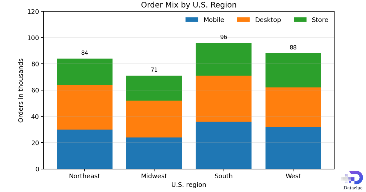
Figure 5. Stacked bar plot example showing totals and composition
Stacked bars help when you need both the total and the parts. The South has the highest total, and the chart also shows how that total is split among mobile, desktop, and store orders.
Percentage bar plot
Table 7. Order share by U.S. region in percent
| U.S. region | Mobile share | Desktop share | Store share |
|---|---|---|---|
| Northeast | 35.7% | 40.5% | 23.8% |
| Midwest | 33.8% | 39.4% | 26.8% |
| South | 37.5% | 36.5% | 26.0% |
| West | 36.4% | 34.1% | 29.5% |
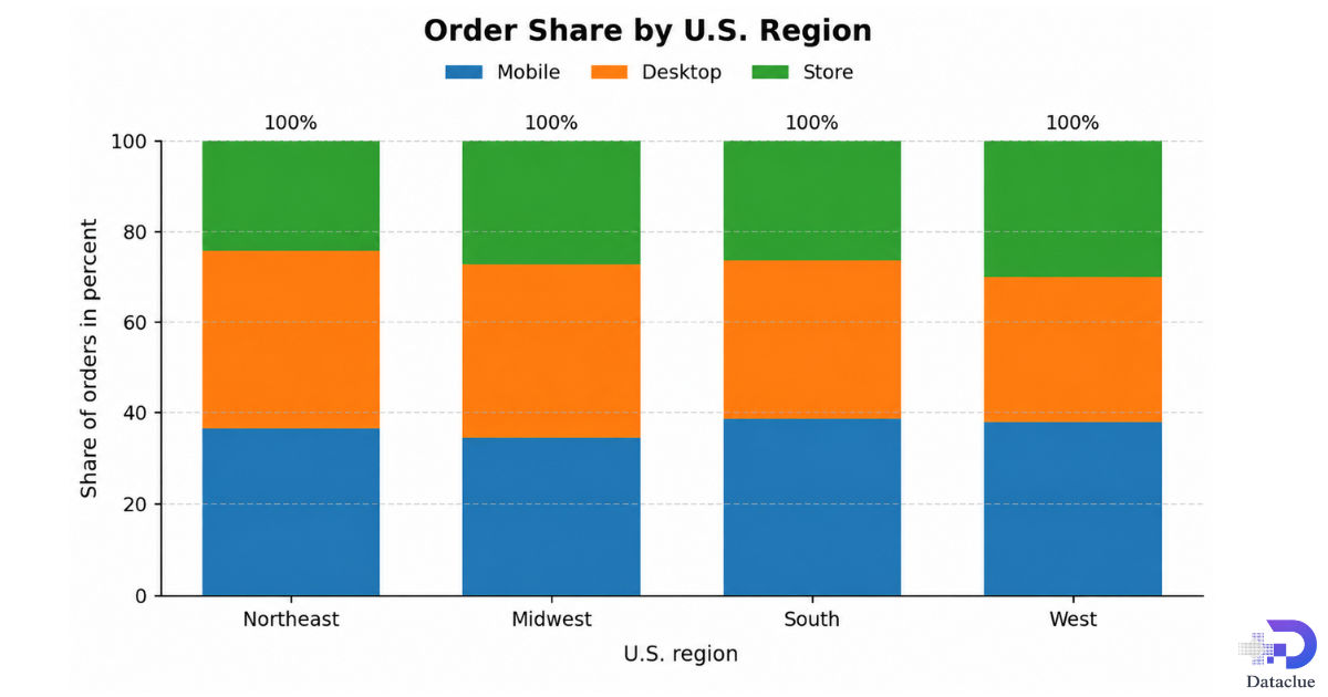
Every bar in a percentage chart reaches 100 percent. That makes it easier to compare composition across regions. The raw total size disappears, so this chart should be paired with a total table or a stacked chart when total size also matters.
Deviation bar plot
Table 8. Difference between actual and target orders
| U.S. region | Difference in thousands |
|---|---|
| Northeast | 4 above |
| Midwest | 4 below |
| South | 6 above |
| West | 4 below |
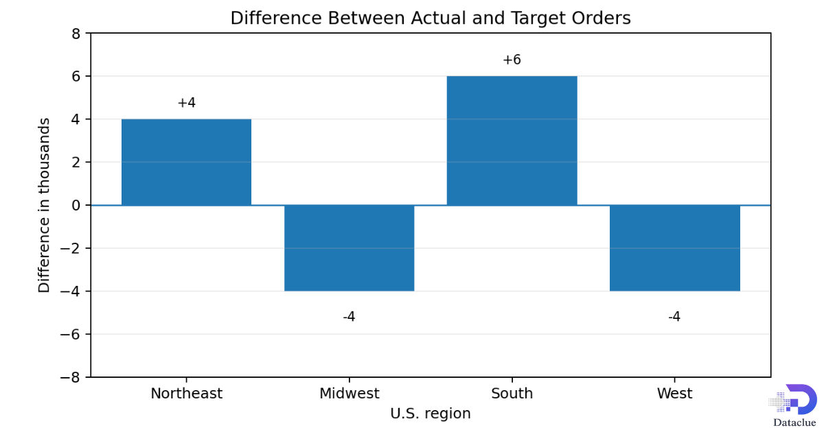
Figure 7. Deviation bar plot example using change from target.
This chart does not repeat the full totals. Instead, it answers a sharper question: how far above or below target is each region? That is why deviation bars are useful for performance reporting.
Broken scale bar plot
Table 9. Resolved tickets by site
| Site | Resolved tickets |
|---|---|
| Site A | 28 |
| Site B | 34 |
| Site C | 31 |
| Site D | 420 |
| Site E | 26 |
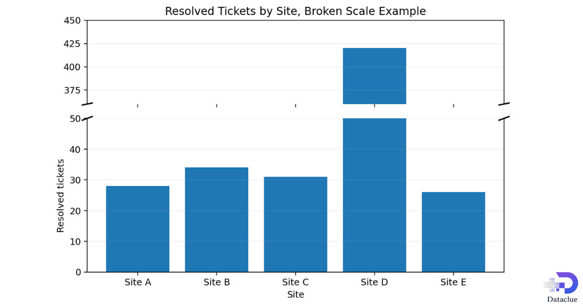
Figure 8. Broken scale bar plot example used only when one value is much larger than the rest.
Site D is so much larger than the other sites that a normal axis would make the smaller bars hard to see. The broken scale solves that visibility problem, but it should be used with care because it weakens direct visual comparison.
Bar Plot vs Histogram and Other Similar Charts
A bar plot and a histogram can look alike, but they answer different questions. A bar plot compares categories. A histogram shows the distribution of a numeric variable by grouping values into intervals.
Table 10. Bar plot compared with histogram
| Feature | Bar plot | Histogram |
|---|---|---|
| Main purpose | Compare categories | Show a numeric distribution |
| Typical data | Categorical groups | Continuous numeric values grouped into intervals |
| Bar spacing | Bars usually have space between them | Bars usually touch |
| Question answered | Which category is larger or smaller? | Where do values cluster or spread out? |
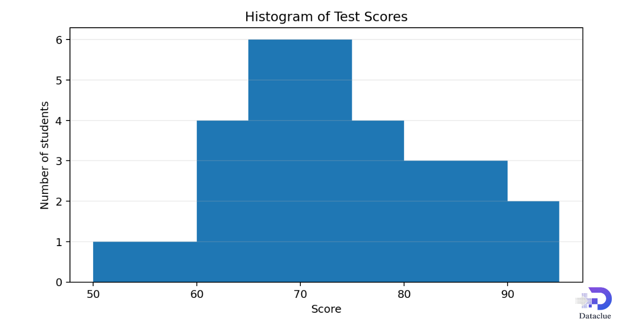
In the histogram above, the bars touch because the score ranges form a continuous scale. If your data are time based and you need to show a smooth trend, a line chart is often better than either a bar plot or a histogram. If you need totals and parts at the same time, a stacked bar plot may be the better choice.
How to Make a Bar Plot by Hand or with Common Software
A good bar plot starts with the question, not the software. First decide what the categories are, what value each bar should show, and what comparison the reader needs to make.
Simple method
- Collect the category labels and the values.
- Pick the bar plot type that matches the question.
- Use a value scale that starts at zero for normal bar comparisons.
- Plot the bars with equal width and consistent spacing.
- Add a title, units, and a legend if more than one series appears.
- Check the chart against the source data before you publish it.
Excel, Minitab, SPSS, and Python
In Excel, enter the category labels and values, select the data, and insert a column or bar chart. In Minitab and SPSS, choose a bar chart from the graph tools, place the category field on the category axis, and then select counts or summary values. In Python, Matplotlib provides bar for vertical charts and barh for horizontal charts, with extra options for grouped, stacked, and error bar styles.
Design Rules for Accurate and Easy-to-Read Bar Plots
A bar plot is simple, but small design choices can change what readers think they see. Good design protects the truth in the data.
Start the value axis at zero
The meaning of a bar comes from its length. If the value axis starts too high, a small numeric gap can look much larger than it really is. For that reason, ordinary bar charts should usually start at zero.
Keep order consistent
In grouped or stacked charts, keep the category order and the series order the same from start to finish. If the order changes, the chart becomes harder to scan and easier to misread.
Use simple color choices
Color should separate meaning, not create noise. A single series often needs only one main color. Multiple series need a few distinct colors, but the set should stay simple.
Make labels easy to scan
Choose horizontal bars when labels are long. Keep titles direct, note the unit clearly, and use data labels only when they add real value.
Reduce clutter
Too many grid lines, borders, or labels can make a chart feel heavy. Keep only what helps the reader compare the values and understand the message.
Common Mistakes, FAQs, and Final Takeaway
Common mistakes to avoid
- Using a bar plot for continuous data when a histogram would be better.
- Cutting the axis so a small gap looks huge.
- Leaving out the unit or the source note.
- Using too many series in a grouped chart.
- Changing the series order from one category to the next.
- Adding error bars without saying what they mean.
- Using a broken scale without marking the break clearly.
Frequently asked questions
What is a bar plot?
A bar plot (or bar chart) is a visual tool that uses horizontal or vertical bars to compare data across different groups or categories.When should you use a bar plot?
You use a bar plot to compare distinct, non-overlapping categories, show changes over time if categories are discrete, or display frequencies and counts.What are the main types of bar plots?
- Vertical bar chart (Column chart): Bars stand upright.
- Horizontal bar chart: Bars lie sideways, which helps when category names are long.
- Grouped (Clustered) bar chart: Shows multiple bars side-by-side for each category to compare sub-groups.
- Stacked bar chart: Places sub-group bars on top of each other to show parts of a whole.
What is the difference between a bar plot and a histogram?
A bar plot compares distinct categories (like types of fruit), while a histogram shows the distribution of numerical data by grouping numbers into continuous bins or ranges (like age groups). There are also spaces between bars in a bar plot, but bars touch in a histogram.How do you make a bar plot?
- Collect your categorical data and numerical values.
- Draw the horizontal (x) axis and vertical (y) axis.
- Label the categories on one axis and the scale of values on the other.
- Draw bars for each category so their height or length matches the data value.
Is a bar plot the same as a bar chart?
In everyday use, yes. The two terms usually mean the same thing.
When should I use grouped bars instead of stacked bars?
Use grouped bars when exact side-by-side comparison matters more than seeing a total and its parts.
Why should most bar charts start at zero?
Because the reader compares bar length. Starting far above zero can exaggerate small differences.
When is a horizontal bar plot better?
It is better when labels are long, when ranking matters, or when there are many categories.
Should I show raw totals or percentages?
Show raw totals when size matters. Show percentages when composition matters. In some cases, showing both is best.
Final takeaway
A bar plot works best when it answers a clear comparison question with honest design. Choose the type that matches the decision you want the reader to make. Use clean data, clear labels, and a zero baseline for normal bar comparisons. When you do that, a simple bar plot can explain a lot in very little space.