
Cross Tabulation Explained: Tables, Percentages, and Chi Square
Learn cross tabulation with clear contingency table examples, row and column percentages, chi square testing, Cramer's V, Excel, SPSS, R, and Python.
CROSS TABULATION
Contingency Tables, Percentages, Examples, and Chi-Square Analysis
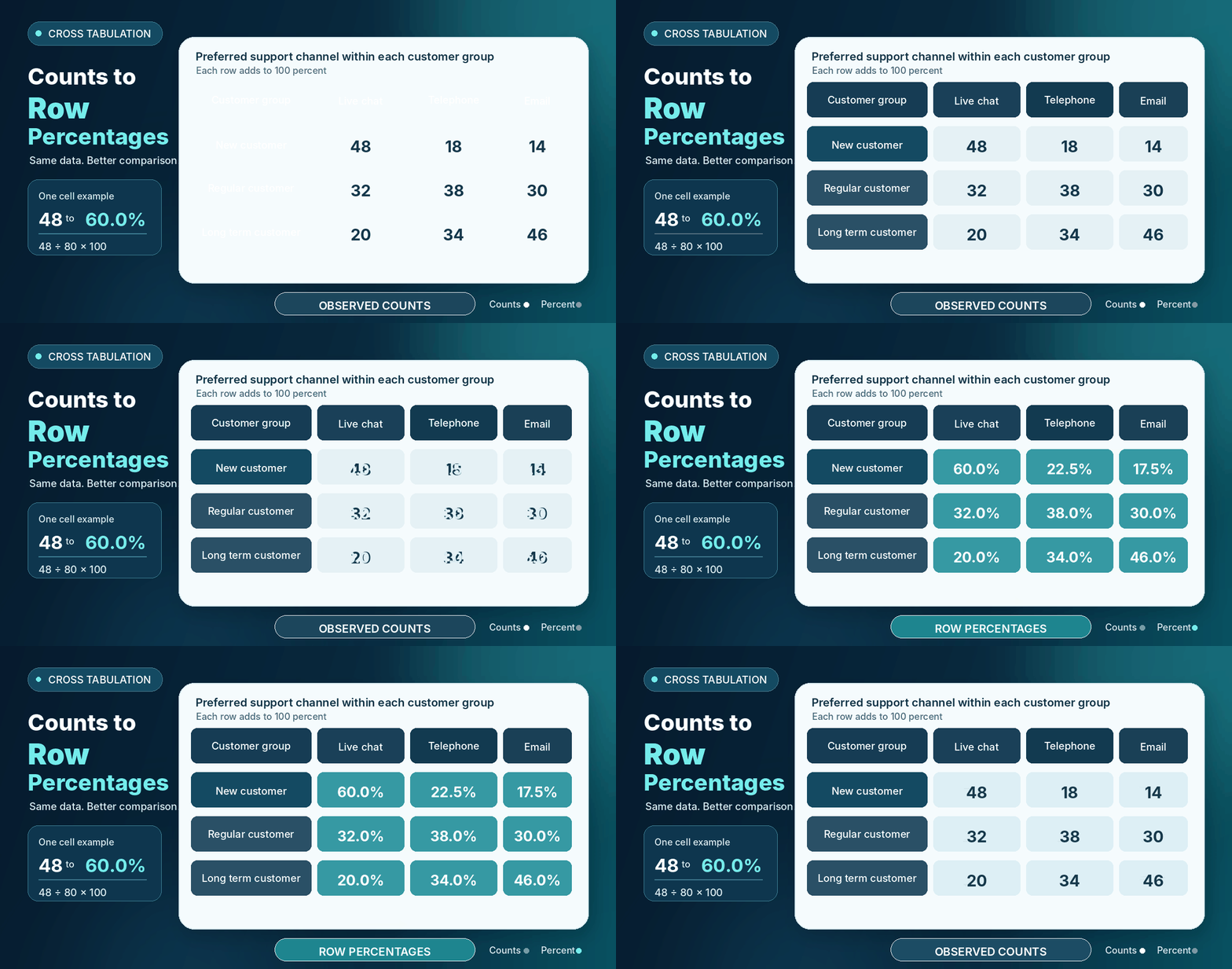
A customer experience team wants to know whether people at different stages of a membership prefer different support channels. A simple frequency table can show the total number of chat, telephone, and email choices. It cannot show how those choices change across customer groups. Cross tabulation solves that problem by placing two categorical variables in one table.
Quick definition: Cross tabulation is a method for summarizing two categorical variables in one table. Each cell shows the count or percentage for one combination of categories. Analysts use row, column, or total percentages to compare groups, then may use a chi square test to assess evidence of association.
This guide explains how to build a contingency table, choose the correct percentage, interpret patterns, calculate expected counts, run a chi square test, measure association strength, and report the result. It also shows practical workflows in Excel, SPSS, R, and Python.
Table of contents
- What Is Cross Tabulation?
- Why Is Cross Tabulation Useful?
- Parts of a Contingency Table
- A Complete Cross Tabulation Example
- Absolute and Relative Frequencies
- Row Percentages, Column Percentages, and Total Percentages
- How to Choose Between Row and Column Percentages
- Joint, Marginal, and Conditional Probabilities
- How to Create a Cross Table Step by Step
- How to Interpret a Crosstab Correctly
- Cross Tabulation and the Chi Square Test
- Observed Counts, Expected Counts, and Residuals
- Measuring the Strength of Association
- When Expected Counts Are Small
- Two by Two Contingency Tables
- Cross Tabulation Versus Other Tables
- Cross Tabulation in Excel
- Cross Tabulation in SPSS
- Cross Tabulation in R
- Cross Tabulation in Python
- Visualizing Cross Tabulation Results
- Real World Applications
- Advantages of Cross Tabulation
- Limitations and Simpson's Paradox
- Common Crosstab Mistakes
- How to Report Cross Tabulation Results
- Cross Tabulation Checklist
What Is Cross Tabulation?
Cross tabulation is a descriptive method that counts how often categories from one variable occur with categories from another variable. One variable appears in the rows and the other appears in the columns. The inside cells contain counts, percentages, or both.
The terms cross tabulation, crosstab, cross table, contingency table, and two way table often describe the same basic display. A one way frequency table summarizes one categorical variable. A two way contingency table combines two categorical variables. A multiway table adds a third or later variable, often as layers or separate panels.
Cross tabulation works best when the variables contain categories. Examples include membership level, support channel, treatment group, product type, voting choice, and pass or fail status. A continuous measure such as age or income can be grouped into categories, but grouping removes detail and should have a clear reason.
Why Is Cross Tabulation Useful?
A cross table turns a long list of records into a compact view of group patterns. Survey analysts use it to compare answers across age groups. Healthcare researchers compare outcomes across treatment groups. Schools compare completion status across teaching formats. Businesses compare product choices across customer segments.
The table can reveal differences that a single total hides. It also gives a natural starting point for questions about association. However, a pattern in a table does not prove that one variable caused the other. Study design, missing variables, sampling, and context still matter.
Parts of a Contingency Table
The row labels identify categories of the first variable. The column labels identify categories of the second variable. Each inside cell is a joint count because it represents one category from each variable. For example, 48 customers are both new customers and live chat users.
The row totals and column totals are marginal totals. They summarize one variable without conditioning on the other. The number 280 is the grand total. It should match the number of valid observations included in the table.
| Customer group | Live chat | Telephone | Row total | |
|---|---|---|---|---|
| New customer | 48 | 18 | 14 | 80 |
| Regular customer | 32 | 38 | 30 | 100 |
| Long term customer | 20 | 34 | 46 | 100 |
| Column total | 100 | 90 | 90 | 280 |
A Complete Cross Tabulation Example
The example uses 280 customers. The first variable is customer group. The second variable is preferred support channel. The raw records have been summarized into counts. Every customer contributes to exactly one cell.
The count table already suggests a pattern. New customers select live chat more often than the other channels. Long term customers select email most often. Still, counts are not enough because the group sizes are not all equal. Percentages make the comparison clearer.
| Customer group | Live chat | Telephone | Row total | |
|---|---|---|---|---|
| New customer | 48 | 18 | 14 | 80 |
| Regular customer | 32 | 38 | 30 | 100 |
| Long term customer | 20 | 34 | 46 | 100 |
| Column total | 100 | 90 | 90 | 280 |
Absolute and Relative Frequencies
An absolute frequency is a count. A relative frequency expresses a count as part of a chosen total. The denominator changes the question. A total percentage asks how much of the entire sample belongs to a cell. A row percentage asks how categories are distributed inside a row. A column percentage asks how categories are distributed inside a column.
Counts are essential because percentages based on very small groups can look more stable than they are. Percentages are essential because a large group may have more cases in every cell even when its internal pattern is not stronger.
| Measure | Formula | Example | Meaning |
|---|---|---|---|
| Absolute frequency | Cell count | 48 | Forty eight new customers chose live chat. |
| Total percentage | 48 divided by 280 times 100 | 17.1 percent | Share of the full sample in this cell. |
| Row percentage | 48 divided by 80 times 100 | 60.0 percent | Share of new customers who chose live chat. |
| Column percentage | 48 divided by 100 times 100 | 48.0 percent | Share of live chat users who were new customers. |
Row Percentages, Column Percentages, and Total Percentages
Row percentage equals the cell count divided by its row total, multiplied by 100. In the new customer row, 48 divided by 80 gives 60.0 percent. This means 60.0 percent of new customers prefer live chat.
Column percentage equals the cell count divided by its column total, multiplied by 100. In the live chat column, 48 divided by 100 gives 48.0 percent. This means 48.0 percent of live chat users are new customers.
Total percentage equals the cell count divided by the grand total, multiplied by 100. The same cell gives 48 divided by 280, or 17.1 percent. This means 17.1 percent of all customers are new customers who prefer live chat.
First decide which group you are conditioning on. Then use that group's total as the denominator. Never compare a row percentage with a column percentage as though they were calculated from the same base.
| Percentage type | Denominator | Question answered | Best use | Common mistake |
|---|---|---|---|---|
| Row percentage | The row total | Within this row group, how are outcomes distributed? | Compare outcomes across row groups | Using it when the group of interest is actually in columns |
| Column percentage | The column total | Within this column group, how are row categories distributed? | Describe the composition of each column | Comparing it directly with a row percentage |
| Total percentage | The grand total | What share of all observations is in this cell? | Describe joint sample composition | Treating it as a within group rate |
How to Choose Between Row and Column Percentages
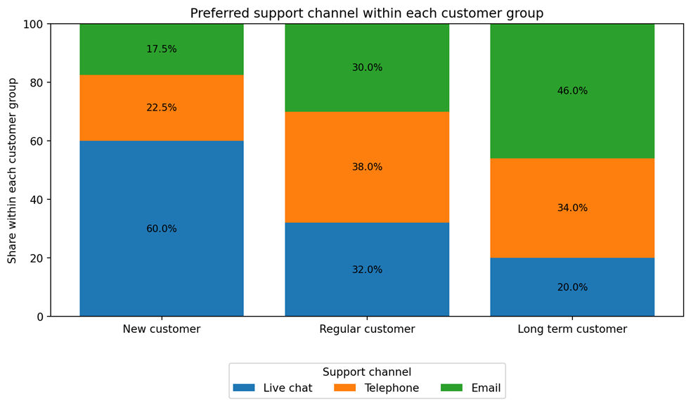
Place the groups you want to compare in rows, then calculate row percentages. For example, if customer groups are the comparison groups, the row percentage table answers how channel preference changes within each group.
If the table is transposed and customer groups move into columns, use column percentages to answer the same question. Transposing the table does not change the underlying observations. It changes only the presentation. The correct denominator follows the group you want to describe.
A quick rule helps. Ask, within which group do I want the percentages to add to 100? Use that group's total as the denominator.
Joint, Marginal, and Conditional Probabilities
A joint probability refers to a specific cell. The probability that a randomly selected customer is new and prefers live chat is 48 divided by 280, or 0.171.
A marginal probability uses a row or column total. The probability that a customer prefers live chat is 100 divided by 280, or 0.357. The probability that a customer is new is 80 divided by 280, or 0.286.
A conditional probability restricts the denominator to a chosen group. The probability of live chat given that the customer is new is 48 divided by 80, or 0.600. Conditional probabilities are the foundation of row and column percentages.
How to Create a Cross Table Step by Step
A careful workflow prevents most cross tabulation errors. The calculation is simple, but the meaning of the denominator, missing values, and category definitions can change the conclusion.
- Define the research question.
- Confirm that both variables are categorical.
- Review category labels, duplicate records, and missing values.
- Place one variable in rows and the other in columns.
- Count each combination of categories.
- Add row totals, column totals, and the grand total.
- Calculate the percentages that match the research question.
- When inference is needed, compare observed and expected counts and assess association.
How to Interpret a Crosstab Correctly
Start with the sample size and the table margins. Then compare the percentages that answer the research question. In this example, 60.0 percent of new customers prefer live chat, compared with 32.0 percent of regular customers and 20.0 percent of long term customers.
A clear reporting sentence is: Among new customers, 60.0 percent selected live chat, compared with 20.0 percent among long term customers. This descriptive difference suggests an association between customer group and preferred support channel, but it does not by itself establish causation.
- Confirm the number of valid observations.
- Check whether missing values were excluded or shown as a category.
- Review row and column totals before studying individual cells.
- Choose the percentage denominator that matches the question.
- Compare percentages as well as counts.
- Look for differences that are large enough to matter in context.
- Use cautious language because a descriptive table does not prove causation.
Cross Tabulation and the Chi Square Test
A cross table describes the sample. A chi square test of independence evaluates whether the observed differences provide evidence of association in the population represented by the study.
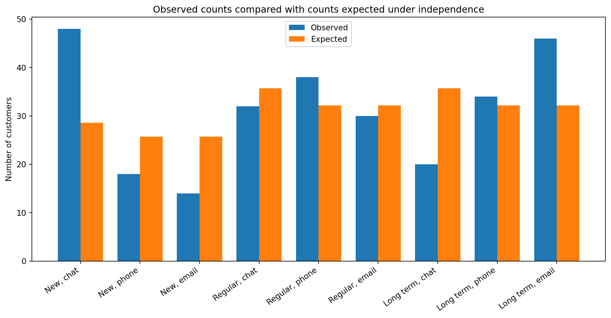
The null hypothesis states that customer group and support channel are independent. The alternative hypothesis states that they are associated. Expected counts show what the table would look like, on average, if the variables were independent.
Expected count equals the row total multiplied by the column total, divided by the grand total. For the new customer and live chat cell, the expected count is 80 multiplied by 100, divided by 280, which equals 28.57. For the long term customer and email cell, the expected count is 100 multiplied by 90, divided by 280, which equals 32.14.
The Pearson statistic is the sum of squared observed minus expected differences divided by expected counts. Degrees of freedom equal the number of rows minus one, multiplied by the number of columns minus one. Here the result is chi square of 35.454 with 4 degrees of freedom and p below 0.001. We reject the null hypothesis and conclude that the data provide evidence of an association. The p value is not the probability that the null hypothesis is true.
| Statistic | Value |
|---|---|
| Pearson chi square | 35.454 |
| Degrees of freedom | 4 |
| Sample size | 280 |
| P value | < 0.001 |
| Cramer's V | 0.252 |
Observed Counts, Expected Counts, and Residuals
An observed count is the actual cell count. An expected count is the average count predicted by the independence model. A raw residual is observed minus expected. A positive residual means more cases than expected. A negative residual means fewer cases than expected.
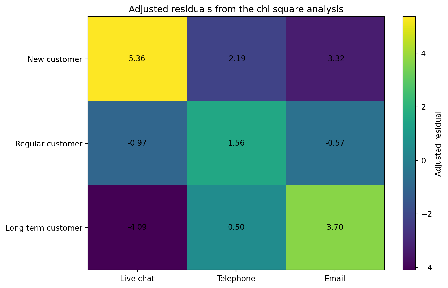
Standardized and adjusted residuals put cell differences on a more comparable scale. Values farther from zero deserve closer attention. They help explain which cells contribute most to the overall chi square result. Residuals should be interpreted as part of the full table, not as isolated proof.
| Cell | Observed | Expected | Adjusted residual | Plain meaning |
|---|---|---|---|---|
| New customer, live chat | 48 | 28.57 | 5.36 | More than expected |
| New customer, email | 14 | 25.71 | -3.32 | Fewer than expected |
| Long term customer, live chat | 20 | 35.71 | -4.09 | Fewer than expected |
| Long term customer, email | 46 | 32.14 | 3.70 | More than expected |
Measuring the Strength of Association
A p value addresses evidence against independence. It does not measure how large the association is. Cramer's V is useful for a table larger than two by two. It ranges from zero to one, where zero indicates no observed association in the table.
For the customer example, Cramer's V is 0.252. This is a noticeable association, but its practical importance should be judged with business context, costs, customer needs, and the study design. Universal small, medium, and large cutoffs can oversimplify interpretation.
| Measure | Best setting | What it describes | Important caution |
|---|---|---|---|
| Phi coefficient | Two by two table | Strength of association for two binary variables | Depends on table structure |
| Cramer's V | Larger nominal tables | Standardized strength of association | Context matters more than fixed labels |
| Odds ratio | Suitable two by two table | Ratio of two odds | Not the same as a risk ratio |
| Relative risk | Designs with interpretable risks | Ratio of two probabilities | Requires a suitable sampling design |
| Cohen's kappa | Agreement between two raters | Agreement beyond chance | Not a general association measure |
When Expected Counts Are Small
The usual chi square test relies on an approximation. Sparse expected counts can make that approximation unreliable. Review the expected count table rather than applying a single rule without thought.
Possible responses include collecting more data, combining categories when the combination has a real scientific meaning, or using an exact or simulation based method. Fisher's exact test is common for a two by two table. Combining categories only to obtain a smaller p value is not good practice.
Two by Two Contingency Tables
A two by two table contains two categories for each variable. It is common in experiments, clinical studies, quality checks, and conversion analysis. The example below compares a reminder email with registration completion.
The Pearson chi square statistic is 16.000 with 1 degree of freedom and p below 0.001. Fisher's exact test also gives p below 0.001. The relative risk is 1.50, while the odds ratio is 3.00. The two measures are different because odds are not probabilities.
| Reminder email | Completed | Not completed | Total |
|---|---|---|---|
| Sent | 90 | 30 | 120 |
| Not sent | 60 | 60 | 120 |
| Total | 150 | 90 | 240 |
Supporting calculation table
| Measure | Calculation | Value | Interpretation |
|---|---|---|---|
| Completion risk with reminder | 90 divided by 120 | 0.75 | Seventy five percent completed |
| Completion risk without reminder | 60 divided by 120 | 0.50 | Fifty percent completed |
| Relative risk | 0.75 divided by 0.50 | 1.50 | Completion was 1.5 times as likely |
| Odds ratio | (90 times 60) divided by (30 times 60) | 3.00 | The completion odds were three times as high |
| Phi coefficient | Square root of chi square divided by 240 | 0.258 | Association strength for this two by two table |
Cross Tabulation Versus Other Tables
A cross table is a specific summary of category combinations. A PivotTable is a broader interactive tool that can create a crosstab but can also calculate sums, averages, and other measures. A confusion matrix looks like a contingency table, but it has a special purpose: comparing predicted classes with actual classes.
| Method | Main purpose | Typical data | Key difference |
|---|---|---|---|
| One way frequency table | Summarize one variable | One categorical variable | No cross classification |
| Cross tabulation | Compare category combinations | Two or more categorical variables | Focuses on joint counts and percentages |
| PivotTable | Interactive summary and aggregation | Categorical and numeric fields | Can calculate sums, means, counts, and more |
| Correlation matrix | Summarize pairwise numeric association | Mostly numeric variables | Not designed for category counts |
| Confusion matrix | Evaluate classification predictions | Actual and predicted classes | Rows and columns have matched prediction meaning |
| Grouped bar chart | Visualize category comparisons | Summarized counts or percentages | A chart, not the underlying table |
Cross Tabulation in Excel
Excel can create a crosstab through a PivotTable. Menu wording can vary by version, but the basic process is stable. Keep one observation per row and one variable per column.
- Arrange the source data in columns with one header row.
- Select a cell in the data, then choose Insert and PivotTable.
- Place customer group in Rows and support channel in Columns.
- Place a record identifier in Values and summarize it as Count.
- To show percentages, open Value Field Settings and choose a row, column, or grand total percentage.
- Check that the PivotTable grand total matches the number of valid records.
Cross Tabulation in SPSS
SPSS provides counts, percentages, expected values, residuals, chi square tests, and association measures from the Crosstabs dialog. Always inspect the Cells options because the default output may not include the percentage needed for your question.
- Choose Analyze, Descriptive Statistics, then Crosstabs.
- Move one variable to Rows and the other to Columns.
- Open Cells and request observed counts.
- Add expected counts when running a chi square test.
- Select row, column, or total percentages based on the research question.
- Open Statistics and request chi square and Phi and Cramer's V when appropriate.
Cross Tabulation in R
Base R can create and analyze the table without an added package. The table function creates counts. addmargins adds totals. prop.table returns proportions. The margin argument controls whether proportions are calculated within rows or columns.
customer_group <- c(
  rep("New customer", 80),
  rep("Regular customer", 100),
  rep("Long term customer", 100)
)

support_channel <- c(
  rep("Live chat", 48), rep("Telephone", 18), rep("Email", 14),
  rep("Live chat", 32), rep("Telephone", 38), rep("Email", 30),
  rep("Live chat", 20), rep("Telephone", 34), rep("Email", 46)
)

tab <- table(customer_group, support_channel)

tab
addmargins(tab)
prop.table(tab)
prop.table(tab, margin = 1)
prop.table(tab, margin = 2)

test <- chisq.test(tab)
test
test$expected
test$stdres
Cross Tabulation in Python
The pandas crosstab function builds count and percentage tables. The normalize argument can calculate proportions within rows, columns, or the full table. SciPy's chi2_contingency function returns the test statistic, p value, degrees of freedom, and expected counts.
import pandas as pd
from scipy.stats import chi2_contingency

data = pd.DataFrame({
    "customer_group": (
        ["New customer"] * 80
        + ["Regular customer"] * 100
        + ["Long term customer"] * 100
    ),
    "support_channel": (
        ["Live chat"] * 48 + ["Telephone"] * 18 + ["Email"] * 14
        + ["Live chat"] * 32 + ["Telephone"] * 38 + ["Email"] * 30
        + ["Live chat"] * 20 + ["Telephone"] * 34 + ["Email"] * 46
    )
})

counts = pd.crosstab(
    data["customer_group"],
    data["support_channel"],
    margins=True
)

row_percentages = pd.crosstab(
    data["customer_group"],
    data["support_channel"],
    normalize="index"
) * 100

column_percentages = pd.crosstab(
    data["customer_group"],
    data["support_channel"],
    normalize="columns"
) * 100

total_percentages = pd.crosstab(
    data["customer_group"],
    data["support_channel"],
    normalize="all"
) * 100

observed = pd.crosstab(
    data["customer_group"],
    data["support_channel"]
)

chi2, p_value, degrees_of_freedom, expected = chi2_contingency(observed)

print(counts)
print(row_percentages.round(1))
print(column_percentages.round(1))
print(total_percentages.round(1))
print(chi2, p_value, degrees_of_freedom)
print(expected)
Visualizing Cross Tabulation Results
A good visual answers a specific question. Use a one hundred percent stacked bar chart to compare the composition of groups with different sizes. Use a residual heatmap to show where observed counts are above or below independence expectations. Avoid three dimensional charts because perspective can distort size.
Every chart should state whether it displays counts or percentages. It should include readable labels, a useful caption, and alt text. Color should support the message, not carry the full meaning by itself.
| Visual | Best use | Main caution |
|---|---|---|
| Grouped bar chart | Compare a small number of counts or percentages | Counts can mislead when group sizes differ |
| One hundred percent stacked bar chart | Compare composition across groups | Small segments can be hard to label |
| Heatmap | Scan many cells quickly | Include numbers and accessible text |
| Mosaic plot | Show joint distribution through area | Can be unfamiliar to beginners |
| Residual heatmap | Locate cells driving a chi square result | Requires careful explanation |
Real World Applications
Cross tabulation is useful whenever the main variables are categories and the goal is to compare groups. The table is often the first analysis because it is easy to audit and explain.
- Market research: compare product preference across customer segments.
- Healthcare: compare outcome categories across treatment groups.
- Education: compare completion status across learning formats.
- Human resources: compare training participation across departments.
- Customer experience: compare support channel preference across membership levels.
- Manufacturing: compare defect type across production lines.
- Public policy: compare service use across regions.
- Digital analytics: compare conversion status across traffic sources.
Advantages of Cross Tabulation
- It gives a clear summary of category combinations.
- It supports direct subgroup comparisons.
- It works with simple counts and understandable percentages.
- It connects naturally with chi square tests and association measures.
- It can be created in common spreadsheet and statistical software.
- It is useful for reporting surveys and operational data.
Limitations and Simpson's Paradox
A two variable table can hide an important third variable. Simpson's paradox occurs when a combined pattern reverses or changes after the data are separated into relevant subgroups.
Imagine two service teams. Team B has a better success rate for both simple and complex cases, but Team B handles far more complex cases. The combined success rate can make Team A appear slightly better. The lesson is not that cross tables are unreliable. The lesson is that analysts must consider meaningful stratifying variables and the data collection process.
- A cross table does not establish causation.
- Large tables become hard to read.
- Sparse cells can weaken standard chi square methods.
- Missing data can change the percentage base.
- Survey weights may be needed for representative population estimates.
- Categorizing a continuous variable discards information.
- A hidden third variable can change the apparent relationship.
- Very large samples can make small differences statistically significant.
Common Crosstab Mistakes
Most errors come from the denominator, category design, missing values, or overconfident interpretation. A polished table cannot rescue unclear variables or a weak study design.
| Myth | Fact |
|---|---|
| The largest count proves the strongest preference. | Counts must be read with the group total. |
| Row and column percentages are interchangeable. | They use different denominators and answer different questions. |
| A significant chi square result proves a large effect. | Significance and association strength are different. |
| A crosstab proves causation. | It describes association unless the study design supports a causal claim. |
| Every expected cell must always be at least five. | Sparse counts require careful review and a method suited to the table. |
| Combining categories is harmless. | It changes the question and needs a scientific reason. |
| A p value of 0.000 should be reported. | Report p below 0.001 when the rounded value is smaller than 0.001. |
How to Report Cross Tabulation Results
For the main example, a concise report is: Customer group was associated with preferred support channel, chi square(4, N = 280) = 35.45, p < 0.001, Cramer's V = 0.252. Among new customers, 60.0 percent preferred live chat, while 46.0 percent of long term customers preferred email.
Report exact p values when they can be shown clearly. Do not write p equals 0.000. Include meaningful counts and percentages, not only the test result.
| Purpose | Template |
|---|---|
| Descriptive | Among [group], [count] of [total], or [percentage], selected [category], compared with [percentage] in [comparison group]. |
| Chi square | A chi square test of independence indicated an association between [variable one] and [variable two], chi square(df, N = sample size) = value, p = value. |
| Cramer's V | The association had a Cramer's V of value, interpreted in the context of the table and subject area. |
| Two by two | The outcome risk was [risk] in group one and [risk] in group two, giving a relative risk of [value] and an odds ratio of [value]. |
Cross Tabulation Checklist
- Both variables are categorical.
- Category labels are clear and mutually understandable.
- Missing data have been reviewed.
- The grand total matches the valid dataset.
- The percentage denominator matches the question.
- Observed and expected counts are not confused.
- The statistical method suits the table and study design.
- An association measure is reported when inference is used.
- The conclusion avoids unsupported causal language.
- Tables and charts include clear labels and accessible descriptions.
Frequently Asked Questions
What is cross tabulation?
Cross tabulation is a method for summarizing two categorical variables in one table. Rows show categories of one variable, columns show categories of the other, and each inside cell contains a count or percentage for one category combination. It helps readers compare groups and identify patterns.
Is a crosstab the same as a contingency table?
In most introductory and applied settings, crosstab, cross table, contingency table, and two way table refer to the same type of display. Some fields use the terms with small differences, but they all organize joint counts or percentages for categorical variables.
What data type is used in a cross table?
A cross table usually uses categorical variables. These may be nominal categories, such as support channel, or ordered categories, such as low, medium, and high. Continuous values can be grouped, but grouping should have a clear purpose because it removes detail.
What is a cell frequency?
A cell frequency is the number of observations in one combination of row and column categories. In the example, 48 is the cell frequency for new customers who prefer live chat. It is also called an observed count.
What are marginal totals?
Marginal totals are the row totals and column totals around the edge of a contingency table. They summarize one variable without conditioning on the other variable. The final total where the margins meet is the grand total.
What is the difference between row and column percentages?
A row percentage divides a cell by its row total. A column percentage divides a cell by its column total. They answer different questions. Row percentages describe the distribution inside rows, while column percentages describe the composition inside columns.
How do I choose the correct percentage?
Choose the group that should add to 100 percent. If you want to compare outcomes within customer groups placed in rows, use row percentages. If the groups are in columns, use column percentages. Use total percentages only when describing the full sample.
Can cross tabulation show causation?
No. A cross table can show an observed association, but it does not prove that one variable caused the other. Causal conclusions require a study design and assumptions that address confounding, selection, timing, and alternative explanations.
What is an expected frequency?
An expected frequency is the average cell count predicted when the row and column variables are independent. It is calculated from the row total, column total, and grand total. The chi square test compares observed counts with these expected counts.
What statistical test is used with a contingency table?
The Pearson chi square test of independence is common for a two way contingency table. Fisher's exact test may be suitable for a small two by two table. The correct choice depends on expected counts, table size, sampling, and study design.
What does Cramer's V mean?
Cramer's V is a standardized measure of association for nominal contingency tables. It ranges from zero to one. A value near zero indicates little observed association, while a larger value indicates a stronger pattern. Interpretation should consider the subject and table dimensions.
When is Fisher's exact test used?
Fisher's exact test is often used for a two by two table when sample sizes or expected counts are small. It calculates an exact probability under fixed margins. Larger tables may require other exact or simulation methods.
Can I create a crosstab in Excel?
Yes. Create a PivotTable, place one categorical variable in Rows and another in Columns, then count a record identifier in Values. Excel can also display values as a percentage of the row total, column total, or grand total.
How do I create a crosstab in Python?
Use pandas.crosstab with one series as the index and another as the columns. Add margins for totals. Use normalize equals index, columns, or all for percentages. Pass the count table without totals to scipy.stats.chi2_contingency for a chi square test.
What is the difference between a crosstab and a pivot table?
A crosstab focuses on category combinations, often as counts or percentages. A PivotTable is a broader interactive summary tool. It can create a crosstab, but it can also calculate sums, averages, minimums, maximums, and other statistics.
Conclusion
Cross tabulation organizes combinations of categorical variables in a form that people can inspect and explain. Counts show how many observations fall into each cell. Row, column, and total percentages answer different questions because they use different denominators. A chi square test evaluates evidence of association, while Cramer's V or another suitable measure describes association strength.
Good analysis starts with clear categories, correct totals, and a denominator that matches the research question. It ends with context, effect size, limitations, and careful language. Build a cross table from one of your own categorical datasets, then check whether your interpretation names the group, count, percentage, and denominator.
References
- Numiqo. Cross Table: Analyzing Relationships Between Categorical Variables. Topic overview and introductory context.
- Penn State Statistics Online. Chi Square Test for Independence, STAT 500. Observed counts, expected counts, hypotheses, test statistic, and assumptions.
- Minitab Support. Tabulated Statistics for Cross Tabulation and Chi Square. Definitions of row, column, and total percentages.
- Minitab Support. Interpret All Statistics for Chi Square Test for Association. Expected counts and residual definitions.
- SciPy Documentation. scipy.stats.chi2_contingency. Python implementation and returned values.
- pandas Documentation. pandas.crosstab. Counts, margins, and normalization options.
- Microsoft Support. Create a PivotTable to Analyze Worksheet Data. Current PivotTable workflow.
- Google Search Central. Creating Helpful, Reliable, People First Content. People first content principles.