
Types of Charts and Graphs: How to Choose the Right Chart
Examples, uses, and a clear way to choose the right chart. Learn what each chart shows, when to use it, and how to design it without misleading your reader.
Types of Charts and Graphs: How to Choose the Right Chart
Table of contents
- What Are Charts and Graphs in Statistics?
- Why Are Charts Important?
- How to Choose the Right Chart
- Understand Your Data Before Choosing a Chart
- Anatomy of a Good Chart
- Bar Chart
- Column Chart
- Histogram
- Bar Chart Versus Histogram
- Line Chart
- Scatter Plot
- Box Plot
- Pie Chart and Donut Chart
- Dot Plot and Lollipop Chart
- Area Chart and Stacked Area Chart
- Stacked Bar Chart
- Heatmap
- Bubble Chart
- Violin Plot, Density Plot, and Raincloud Plot
- Error Bars and Confidence Intervals
- Maps and Geographical Charts
- Specialized Statistical Charts
- Exploratory Versus Explanatory Charts
- Data Visualization Best Practices
- How to Use Color in Charts
- Chart Accessibility
- Static, Interactive, and Animated Charts
- Data Storytelling Without Distortion
- Mobile and Responsive Chart Design
- Misleading Charts and Graphs
- Should Every Chart Start at Zero?
- Charts Versus Tables
- How to Read a Chart Step by Step
- How to Create Charts in Excel
- How to Create Charts in Google Sheets
- How to Create Charts in R
- How to Create Charts in Python
- How to Report and Caption a Chart
- Real World Applications
- Common Chart Mistakes
- Chart Selection Checklist
- Frequently Asked Questions
- Conclusion
What Are Charts and Graphs in Statistics?
A chart in statistics is a visual display that turns data into marks such as bars, points, lines, areas, or symbols. It helps people compare values, see patterns, notice unusual cases, and understand how variables relate. A good chart does not replace the data. It gives the data a form that the eye can read quickly.
Featured snippet answer
The main types of charts and graphs include bar charts for category comparison, histograms for numerical distributions, line charts for change over time, scatter plots for relationships, and box plots for grouped distributions. Choose a chart by matching the research question, variable type, scale, audience, and need for exact detail.
The words chart, graph, plot, and diagram often overlap. Different fields and software packages use them in slightly different ways. In this guide, chart is the broad term. Graph and plot refer to displays that map values to axes. Diagram refers to a visual that explains structure, flow, or parts rather than measured values.
Charts can support two kinds of work. An exploratory chart helps the analyst discover what may be happening. An explanatory chart helps an audience understand one clear finding. The same data can support both purposes, but the design will often differ.
Why Are Charts Important?
A table can hold many exact numbers, but patterns may stay hidden. A chart can make a rise, fall, gap, cluster, outlier, or group difference visible in seconds. This makes charts useful in research, education, business, healthcare, public policy, journalism, and daily decision making.
- Summarize a large dataset without listing every value.
- Compare categories or groups on a shared scale.
- Show change across time or another ordered sequence.
- Reveal the shape, spread, and unusual values in a distribution.
- Study the relationship between two numerical variables.
- Communicate uncertainty, targets, and practical context.
- Check assumptions before formal statistical analysis.
A chart is evidence, but it is not the full argument. It cannot explain why a pattern exists unless the study design and supporting analysis allow that conclusion. A scatter plot may show a strong association, yet it cannot prove cause by itself.
How to Choose the Right Chart
The best chart is not the most decorative option. It is the chart that answers the reader’s question with the least confusion. Start by naming the task. Are you comparing categories, showing change, studying a distribution, examining a relationship, showing part of a whole, mapping geography, or displaying uncertainty?
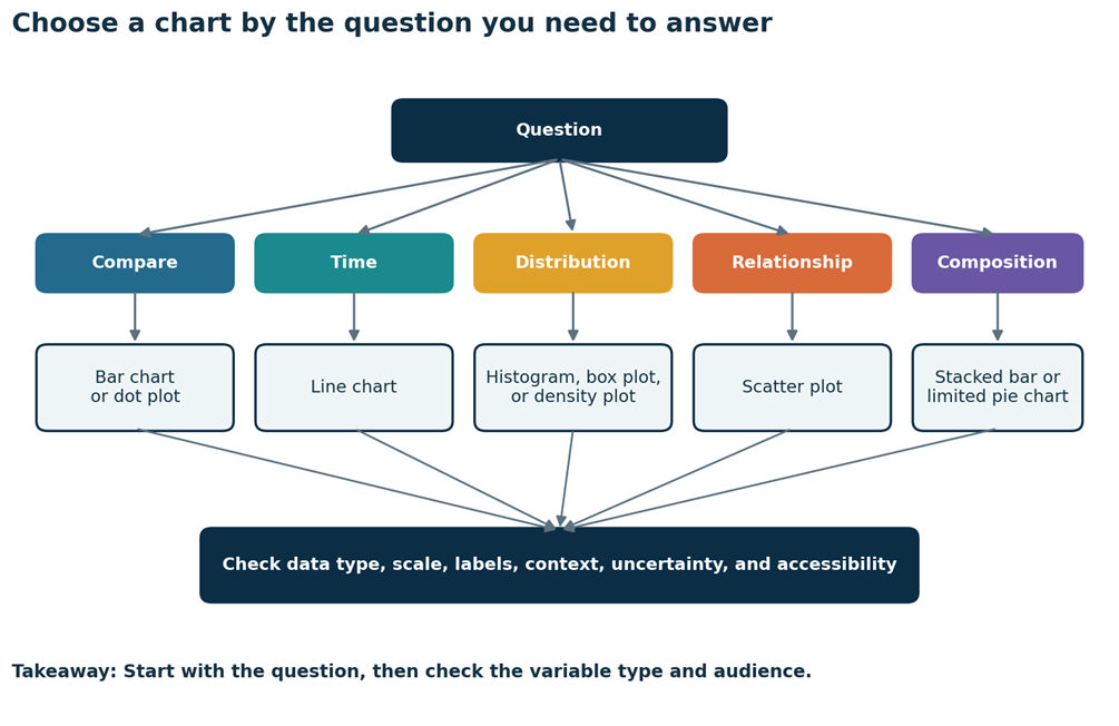
The diagram begins with the question a reader wants to answer. Five branches lead to comparison, change over time, distribution, relationship, and composition. Each branch recommends a chart family. All branches end at a final check for data type, scale, labels, context, uncertainty, and accessibility.
Chart selection matrix
| Analytical question | Data type | Recommended chart | Useful alternative | Avoid when | Example question |
|---|---|---|---|---|---|
| Compare categories | One category plus a count, percent, or summary value | Horizontal bar chart | Dot plot or column chart | There are too many categories or the labels are unclear | Which library branch had the most visits? |
| Show change over time | Ordered time plus a numerical value | Line chart | Column chart for a few periods | The horizontal categories are not ordered | How did water use change by month? |
| Show a distribution | One numerical variable | Histogram | Box plot, dot plot, or density plot | Exact case values are the main need | What do clinic waiting times look like? |
| Show a relationship | Two numerical variables | Scatter plot | Hexbin plot for very dense data | One variable has only a few categories | Does practice time relate to task completion? |
| Show part of a whole | Categories that add to one meaningful total | Stacked bar chart | Limited pie chart | There are many similar parts | How is a budget divided? |
| Show uncertainty | Estimate plus an interval | Dot and range chart | Line with a shaded band | The interval type is not defined | How precise are the group estimates? |
| Show geography | Region plus a rate or count | Choropleth or symbol map | Ranked bar chart | Raw counts mainly reflect population size | Which district has the highest recycling rate? |
These are strong starting points, not fixed laws. Sample size, number of variables, audience skill, screen size, and the main message also matter. When two charts seem reasonable, create both and ask which one makes the intended comparison easier and more honest.
Understand Your Data Before Choosing a Chart
Chart choice depends on the kind of variable you have. A categorical variable places cases into groups. A nominal variable has names without a natural order, such as service channel. An ordinal variable has an order, such as low, medium, and high. A numerical variable records amounts. It may be discrete, such as a count of calls, or continuous, such as waiting time.
Data types and useful charts
| Data type | Examples | Useful charts |
|---|---|---|
| Nominal category | Branch, department, channel | Bar chart, dot plot, pie chart with limits |
| Ordinal category | Satisfaction level, risk group | Ordered bar chart, stacked bar chart |
| Discrete numerical | Number of defects, calls per hour | Bar chart, dot plot, histogram when values are numerous |
| Continuous numerical | Time, temperature, distance | Histogram, box plot, density plot, violin plot |
| Time series | Daily sales, monthly water use | Line chart, column chart, area chart |
| Two numerical variables | Practice hours and completion | Scatter plot |
| Geographical data | Rate by district | Choropleth map, symbol map, ranked bar chart |
| Paired values | Before and after measurements | Connected dot plot, slope chart |
The denominator matters too. A chart of counts may answer a different question from a chart of rates. A large region may have more events simply because more people live there. In that case, a rate per population may support a fairer comparison.
Anatomy of a Good Chart
A clear chart gives readers enough information to understand the measure without guessing. The title should state the subject and, when useful, the main finding. Axis labels should name the variable and unit. Tick marks should follow regular intervals. Legends should sit close to the data they describe. Gridlines should support reading, not compete with the marks.
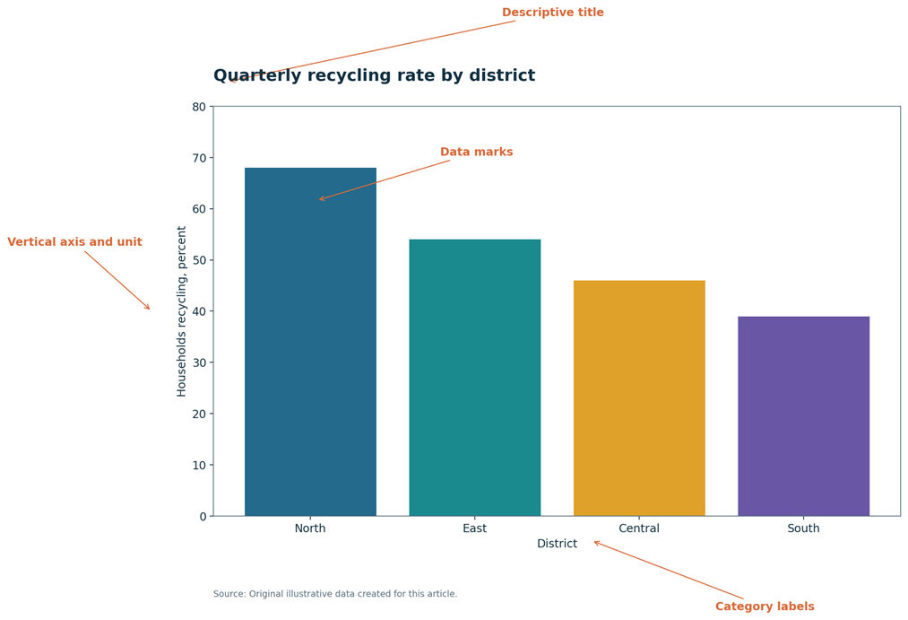 Anatomy of a good chart. A clear chart needs a title, labeled axes, units, readable marks, and a source note.
Long description: The example chart compares recycling rates across four districts. Orange callouts identify the descriptive title, the vertical axis and unit, the category labels, the bars as data marks, and the source note below the chart.
- Title: states what the chart shows.
- Subtitle or caption: adds context, period, sample, or takeaway.
- Horizontal axis: often shows categories, time, or the first numerical variable.
- Vertical axis: shows a value, count, rate, or second numerical variable.
- Units: tell the reader whether values are people, minutes, dollars, percent, or another measure.
- Legend: explains series, symbols, patterns, or colors.
- Annotations: point to events or values that need context.
- Source note: states where the data came from and whether they are illustrative.
- Uncertainty display: explains confidence intervals, error bars, or estimated ranges.
Bar Chart
A bar chart compares values across separate categories. The length of each bar carries the meaning, so the value axis should normally begin at zero. A truncated bar axis can make a small difference look much larger than it is.
Horizontal bars work well when labels are long or when the chart contains many categories. Vertical bars, often called columns, work well when there are only a few categories or when the horizontal order has meaning. Sort categories by value when ranking is the main task. Keep a natural order when the categories already have one, such as age group or rating level.
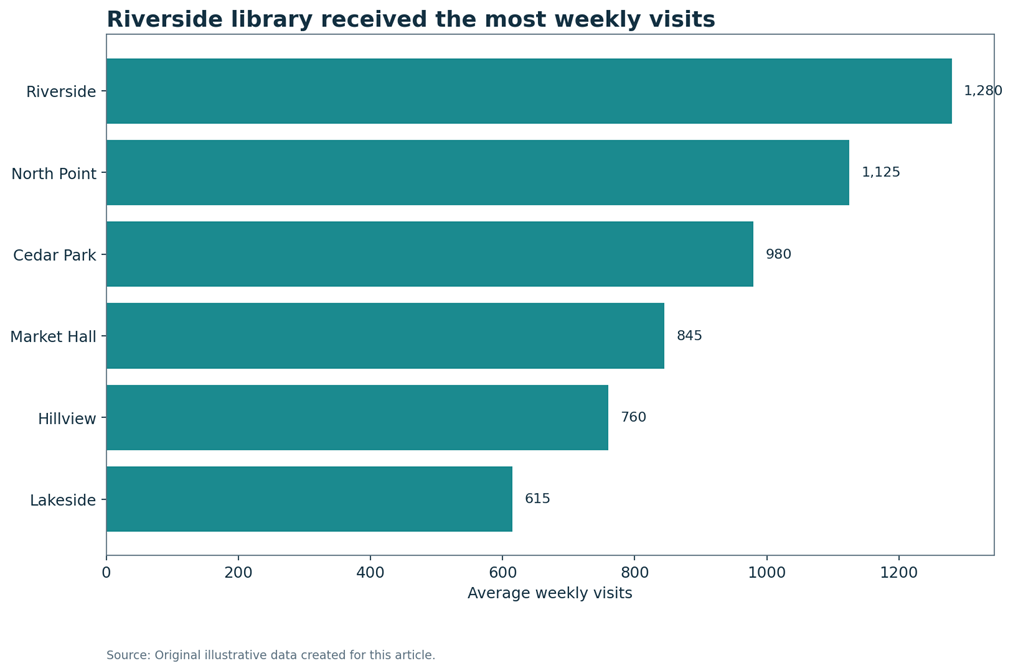 Horizontal bar chart. Horizontal bars make long category labels easy to scan and compare.
Alt text note: Horizontal bar chart ranking six library branches by average weekly visits, with Riverside highest at 1,280 and Lakeside lowest at 615.
Long description: The branches are sorted from the smallest value at the bottom to the largest value at the top. Riverside has 1,280 weekly visits. North Point has 1,125. Cedar Park has 980. Market Hall has 845. Hillview has 760. Lakeside has 615.
The example ranks six fictional library branches. Riverside has the highest weekly visits. The chart uses one main color because the bars all represent the same measure. Direct labels remove the need to estimate values from the axis alone.
Grouped and stacked bars
Grouped bars compare two or more series side by side. Stacked bars show a total and its parts. One hundred percent stacked bars remove total size and focus on composition. These charts become hard to read when there are many series, so consider small multiples or direct labels when the display becomes crowded.
Column Chart
A column chart is a vertical bar chart in many software packages. It can compare a few categories, show counts by period, or display a simple ordered sequence. It works best when labels are short and the number of columns stays limited. Long labels often fit better in a horizontal bar chart.
Do not use a line merely because the categories appear from left to right. Connecting separate categories with a line can suggest a continuous path that does not exist. Use columns or bars when the groups are independent.
Histogram
A histogram shows the distribution of one numerical variable. It divides the numerical scale into intervals called bins, then counts how many values fall inside each interval. The bars touch because the intervals are connected parts of the same scale.
A histogram helps readers see center, spread, skewness, modes, gaps, and possible outliers. Bin width matters. Very wide bins can hide useful detail. Very narrow bins can make random variation look like a meaningful pattern. Test more than one reasonable choice before publishing the chart.
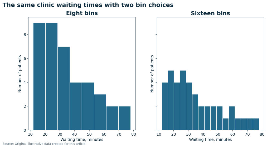
Figure 4. Histogram with two bin choices. More bins reveal local detail, but they can also make a sample look more uneven.
Alt text note: Two histograms of the same clinic waiting times, one with eight bins and one with sixteen bins.
Long description: Both histograms use the same forty waiting times. The eight bin version gives a smoother view. The sixteen bin version shows more local peaks and gaps. The main pattern remains a concentration between about fifteen and forty minutes, followed by a thinner right tail.
Bar Chart Versus Histogram
A bar chart and a histogram may look similar, but they answer different questions. A bar chart compares named categories. A histogram shows how numerical observations are distributed across intervals.
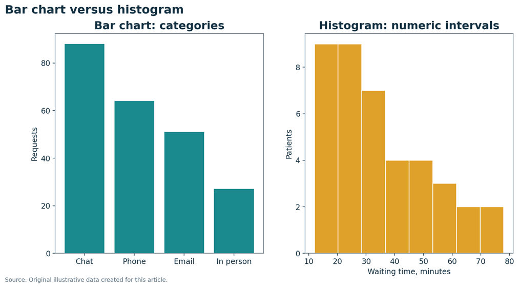
The left plot has separate bars for four contact methods. The gaps show that the categories are distinct. The right plot places bars together because each bar covers a connected interval of waiting time.
Bar chart and histogram comparison
| Feature | Bar chart | Histogram |
|---|---|---|
| Data type | Categorical values | Numerical values |
| Purpose | Compare categories | Show a distribution |
| Horizontal position | Category name | Numerical interval |
| Bar width | Mostly a design choice | Represents interval width |
| Spaces | Usually visible | Usually absent |
| Order | May be sorted or natural | Follows the number scale |
| Zero baseline | Normally required for the value axis | Count axis usually begins at zero, while the value axis follows the data range |
Line Chart
A line chart connects values across an ordered axis, most often time. It is useful for trends, seasonality, turning points, and rates of change. The order must carry meaning. Missing periods should be shown honestly rather than silently connected as if data were present.
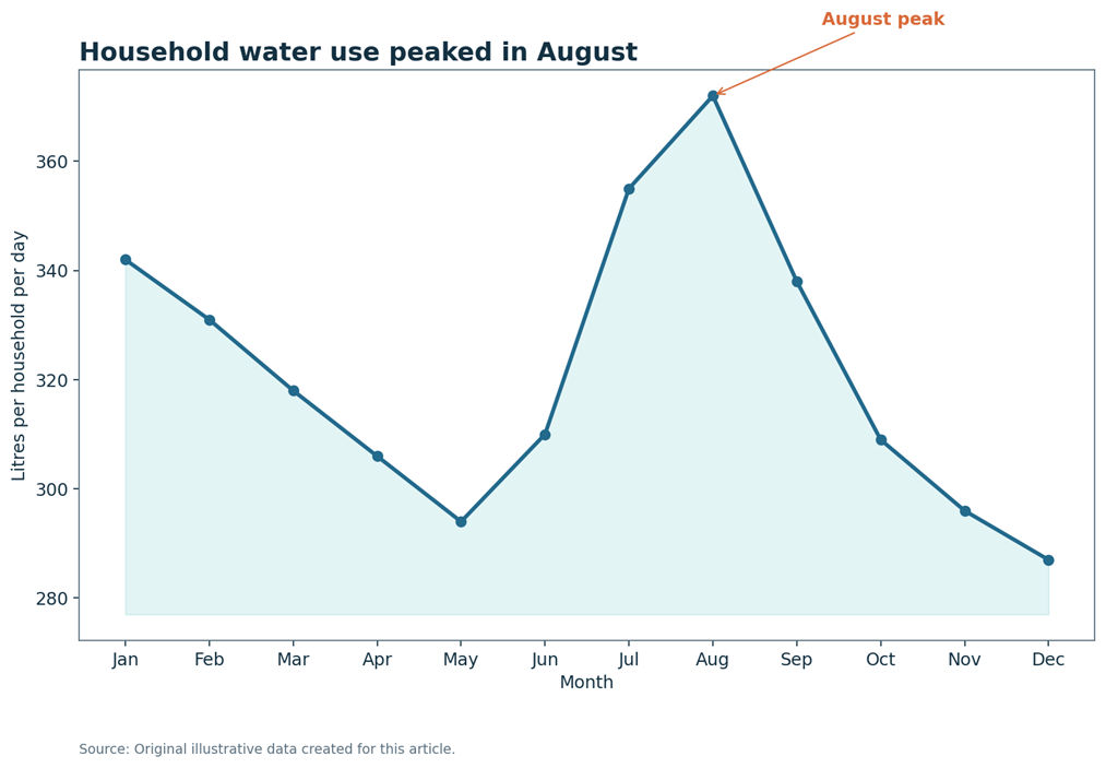 Line chart. A line chart works when order matters and the reader needs to see change over time.
Alt text note: Line chart of litres used per household per day across twelve months, with the highest value in August.
Long description: Water use falls from January through May, rises through the summer, reaches 372 litres in August, and then falls to 287 litres in December.
The water use example falls during spring, rises in summer, and peaks in August. The annotation adds context without covering the line. A restricted vertical scale may be acceptable in a line chart when the goal is to show meaningful variation, but the scale must be visible and the range must not create a false impression.| Month | Litres per household |
|---|---|
| Jan | 342 |
| Feb | 331 |
| Mar | 318 |
| Apr | 306 |
| May | 294 |
| Jun | 310 |
| Jul | 355 |
| Aug | 372 |
| Sep | 338 |
| Oct | 309 |
| Nov | 296 |
| Dec | 287 |
The water use example falls during spring, rises in summer, and peaks in August. The annotation adds context without covering the line. A restricted vertical scale may be acceptable in a line chart when the goal is to show meaningful variation, but the scale must be visible and the range must not create a false impression.
Scatter Plot
A scatter plot shows the relationship between two numerical variables. Each point represents one observation. An upward pattern suggests a positive association. A downward pattern suggests a negative association. A cloud with no clear direction suggests little or no simple association.
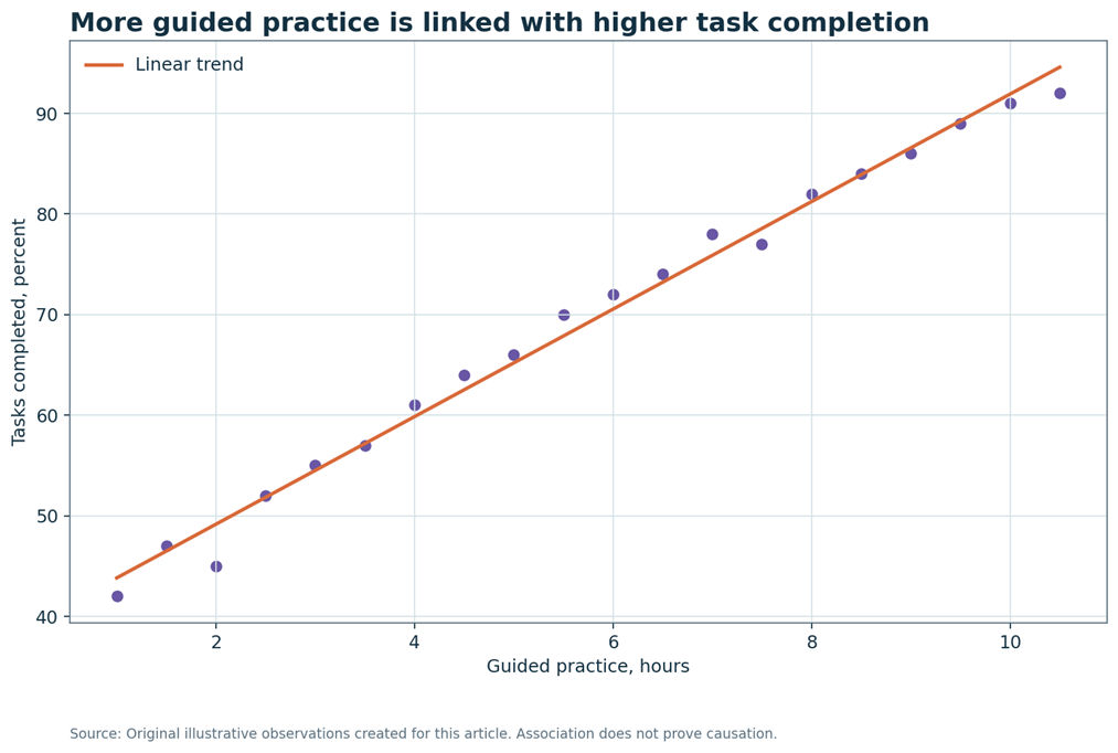 Scatter plot. The points show a strong positive association, but the chart alone cannot prove that practice caused the improvement.
Twenty observations rise from about forty two percent completion at one hour of practice to about ninety two percent at ten and a half hours. The points cluster near an upward line.
| Guided practice, hours | Task completion, percent |
|---|---|
| 1.0 | 42 |
| 1.5 | 47 |
| 2.0 | 45 |
| 2.5 | 52 |
| 3.0 | 55 |
| 3.5 | 57 |
| 4.0 | 61 |
| 4.5 | 64 |
| 5.0 | 66 |
| 5.5 | 70 |
| 6.0 | 72 |
| 6.5 | 74 |
| 7.0 | 78 |
| 7.5 | 77 |
| 8.0 | 82 |
| 8.5 | 84 |
| 9.0 | 86 |
| 9.5 | 89 |
| 10.0 | 91 |
| 10.5 | 92 |
Look for strength, direction, shape, clusters, and unusual points. A straight trend line can summarize a linear pattern, but it should not hide a curve or separate groups. Dense data may need transparency, smaller points, jitter, or a hexbin display.
Correlation does not prove causation. A third variable, selection process, reverse direction, or chance may explain the pattern. Use the study design and subject knowledge before making a causal statement.
Box Plot
A box plot summarizes a numerical distribution with the median, first quartile, third quartile, and a rule for whiskers. The box covers the middle half of the data. The line inside the box shows the median. Points beyond the whiskers are potential outliers, not automatic errors.
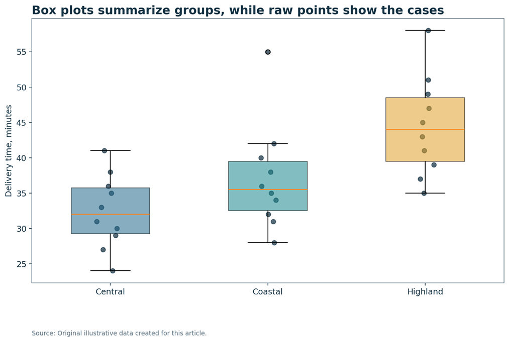
Box plot with raw points. The Highland group has the highest median, while the Coastal group contains one much longer delivery.
Alt text note: Three box plots with raw delivery time points for Central, Coastal, and Highland regions.
Long description: Central delivery times sit mainly between twenty four and forty one minutes. Coastal times are usually between twenty eight and forty two minutes, with one value at fifty five. Highland times are generally higher, between thirty five and fifty eight minutes.
Whisker rules can vary by software. Many programs use one and a half times the interquartile range, but others use the minimum and maximum. State the rule when readers need precision. Add raw points when the sample is small, because a box plot can hide clusters, gaps, and repeated values.Pie Chart and Donut Chart
A pie chart shows parts of one meaningful whole. It can work when there are only a few slices, the total is clear, and the differences are large. Similar angles are hard to compare, so a sorted bar chart is often clearer. A donut chart has the same strengths and limits, with a hole in the center.
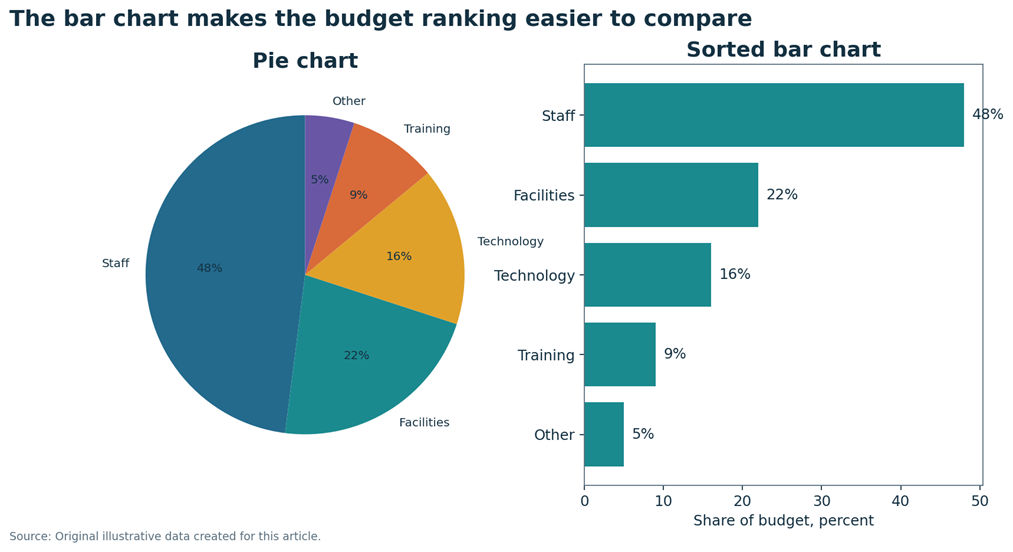 Pie chart compared with a bar chart. A pie chart can show a simple whole, but the sorted bar chart gives a clearer ranking.
Staff takes forty eight percent of the budget, facilities twenty two percent, technology sixteen percent, training nine percent, and other costs five percent. The pie shows the whole. The bar chart makes the rank and differences easier to judge.
View data table alternative| Category | Share |
|---|---|
| Staff | 48 |
| Facilities | 22 |
| Technology | 16 |
| Training | 9 |
| Other | 5 |
- Use one total that adds to one hundred percent.
- Keep the number of slices small.
- Label slices directly when possible.
- Avoid three dimensional effects and exploded slices.
- Use a bar chart when accurate ranking is more important than the shape of the whole.
Dot Plot and Lollipop Chart
A category dot plot places one dot for each category on a shared numerical scale. It often feels lighter than a bar chart and supports accurate comparison by position. A lollipop chart adds a thin stem from the baseline to the dot. The stem may help readers connect the mark to its category, but it should not add decoration without purpose.
A distribution dot plot is different. It places one dot for each observation and stacks repeated or nearby values. This works well for small datasets because readers can see the cases rather than only a summary.
Area Chart and Stacked Area Chart
An area chart fills the space under a line. It can emphasize volume or cumulative change, but the filled area may make a small change feel larger. A stacked area chart shows how parts contribute to a changing total. Middle series are difficult to compare because they do not share a stable baseline.
Use lines or small multiples when the main task is to compare several series. Use stacked area when both total size and broad composition over time matter.
Stacked Bar Chart
A stacked bar chart shows a total divided into parts. A one hundred percent stacked bar chart gives every bar the same length, which makes composition easier to compare. Only the first segment shares a common baseline, so middle segments are harder to compare precisely.
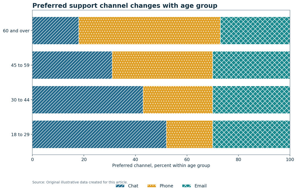 One hundred percent stacked bar chart. Each bar represents one age group and adds to one hundred percent.
Chat is most common among people aged eighteen to twenty nine. Phone preference rises with age and becomes largest among people aged sixty and over. Email stays close to thirty percent in every group.
View data table alternative| Age group | Chat | Phone | |
|---|---|---|---|
| 18 to 29 | 52 | 18 | 30 |
| 30 to 44 | 43 | 27 | 30 |
| 45 to 59 | 31 | 39 | 30 |
| 60 and over | 18 | 55 | 27 |
The example uses patterns as well as color. This helps readers who cannot distinguish every color. The chart shows a clear move from chat toward phone as age rises, while email stays fairly stable.
Heatmap
A heatmap represents values through a color scale. It works well for matrices, correlation tables, calendars, residuals, schedules, and dense patterns across two categorical axes. The legend must state what darker and lighter shades mean.
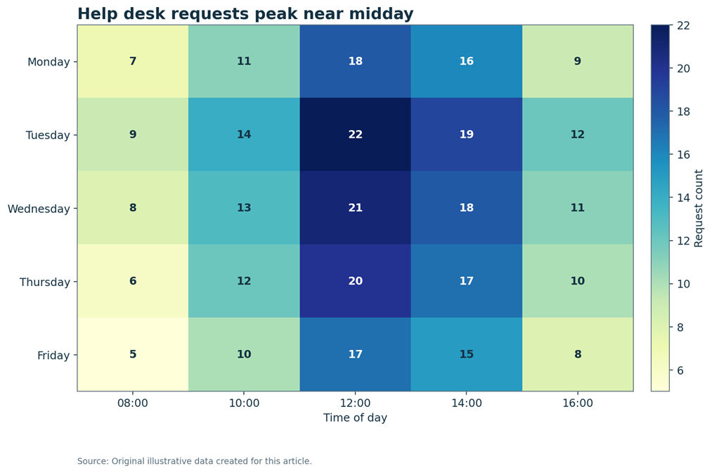 Heatmap with numerical labels. Color supports the pattern, while the printed values keep the chart readable without color alone.
The table has weekdays in rows and five times in columns. The largest value is twenty two on Tuesday at noon. Wednesday at noon has twenty one. Requests are generally lower at eight in the morning and four in the afternoon.
View data table alternative| Day | 08:00 | 10:00 | 12:00 | 14:00 | 16:00 |
|---|---|---|---|---|---|
| Monday | 7 | 11 | 18 | 16 | 9 |
| Tuesday | 9 | 14 | 22 | 19 | 12 |
| Wednesday | 8 | 13 | 21 | 18 | 11 |
| Thursday | 6 | 12 | 20 | 17 | 10 |
| Friday | 5 | 10 | 17 | 15 | 8 |
The help desk heatmap includes numerical labels inside every cell. Color helps the reader see the midday pattern, while the printed values keep the information available when color is hard to perceive or the chart prints in grayscale.
Bubble Chart
A bubble chart extends a scatter plot by using bubble area for a third numerical variable. A fourth variable may use color or shape. Bubble area, not radius, should match the value. Otherwise, large values can look far too large.
Bubbles can overlap and area is hard to compare precisely. Use a regular scatter plot, small multiples, or labels when the third variable is not essential.
Violin Plot, Density Plot, and Raincloud Plot
A density plot estimates the shape of a distribution with a smooth curve. A violin plot mirrors that curve around a center line. A raincloud plot often combines density, a box summary, and raw points. These displays can reveal more shape than a box plot, but they need clear explanation for a general audience.
The smooth curve is an estimate, not a set of raw observations. The appearance depends on the smoothing choice. Show raw points when sample size allows, and avoid suggesting detail that the data cannot support.
Error Bars and Confidence Intervals
Error bars can represent standard deviation, standard error, a confidence interval, a prediction interval, or another range. These meanings are not interchangeable. Every chart must state what the bars show.
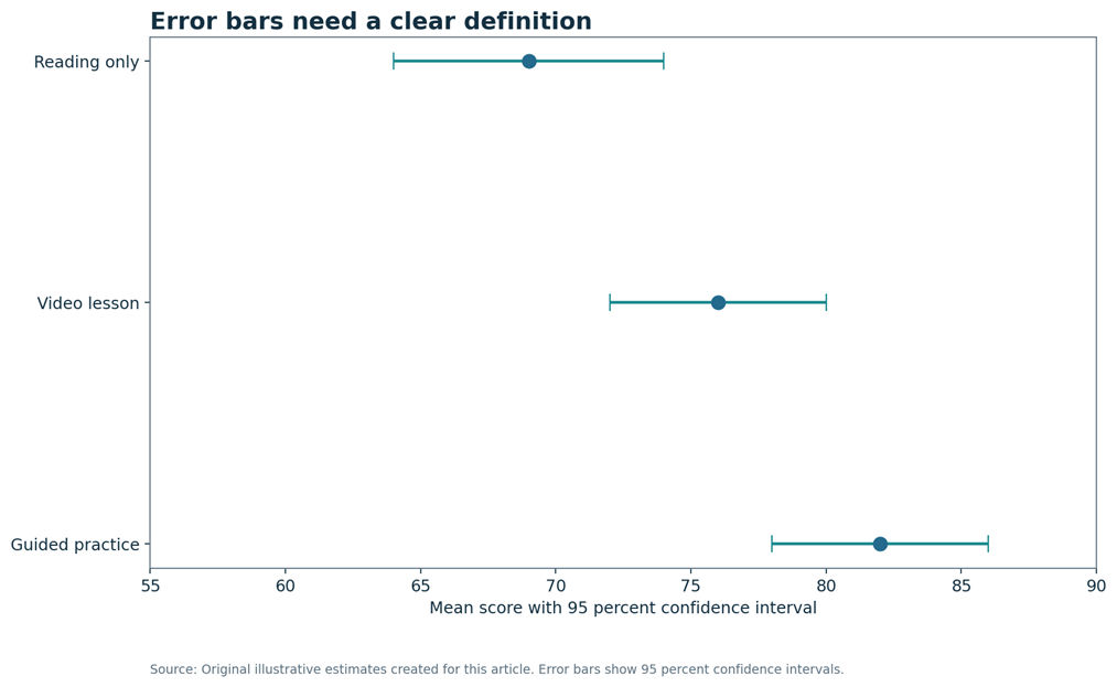 Error bars and confidence intervals. The chart states that the ranges are ninety five percent confidence intervals, not standard deviations.
Guided practice has a mean score of eighty two with an interval from seventy eight to eighty six. Video lesson has seventy six with an interval from seventy two to eighty. Reading only has sixty nine with an interval from sixty four to seventy four.
View data table alternative| Method | Mean score | Lower | Upper |
|---|---|---|---|
| Guided practice | 82 | 78 | 86 |
| Video lesson | 76 | 72 | 80 |
| Reading only | 69 | 64 | 74 |
A confidence interval describes uncertainty around an estimated value under a stated method. It does not show the spread of individual observations. A prediction interval addresses the range for a future observation and is usually wider. A standard deviation describes variation in the observed data.
Maps and Geographical Charts
A choropleth map shades regions by a value such as a rate. A symbol map places circles or other marks at locations. Use rates when regions have different population sizes and the question is about risk or prevalence. Raw totals may mostly reflect how many people live in each area.
Maps can be powerful, but unequal land area can dominate attention. A small urban region may contain many people yet look visually minor. Pair the map with a ranked bar chart when precise comparison matters.
Specialized Statistical Charts
| Chart | Main question |
|---|---|
| Mosaic plot | How do two categorical variables combine? |
| Q Q plot | Does a sample follow a chosen theoretical distribution? |
| Bland Altman plot | How closely do two measurement methods agree? |
| ROC curve | How does a classifier trade sensitivity against false positive rate? |
| Kaplan Meier curve | How does time to an event differ across groups? |
| Control chart | Is a process stable over time? |
| Forest plot | What are the estimates and intervals across studies or groups? |
| Funnel plot | Do study results show patterns linked with precision? |
| Sankey diagram | How do quantities flow between stages or categories? |
These charts need careful definitions and often belong in dedicated tutorials. Use them only when they answer the actual research question and the audience has enough context to read them.
Exploratory Versus Explanatory Charts
An exploratory chart supports open investigation. It may show more variables, labels, or alternative views because the analyst is searching for a pattern. An explanatory chart supports one communication goal. It removes distractions and guides attention to the result that matters.
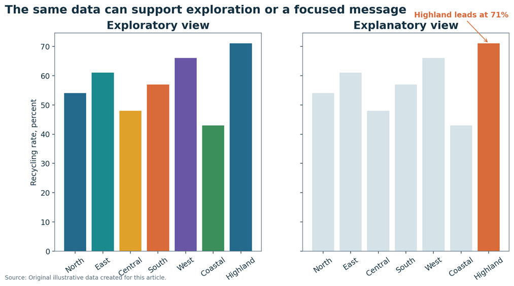 Exploratory versus explanatory chart. The exploratory chart shows every category equally. The explanatory chart highlights the result the audience needs to notice.
The left chart gives every region a separate color for open exploration. The right chart uses light gray for six regions and orange for Highland, which has the highest rate.
View data table alternative| Region | Recycling rate, percent |
|---|---|
| North | 54 |
| East | 61 |
| Central | 48 |
| South | 57 |
| West | 66 |
| Coastal | 43 |
| Highland | 71 |
The two charts use the same data. The first gives every region equal visual weight. The second highlights Highland because the message is that Highland leads. Neither purpose is better in every situation. The right choice depends on whether the task is discovery or communication.
Data Visualization Best Practices
- Start with a clear question and audience.
- Choose a familiar chart unless a less common form adds real value.
- Use a descriptive title and state the unit.
- Sort categories when ranking is important.
- Use restrained color and highlight only what matters.
- Keep fonts and labels readable on mobile screens.
- Show uncertainty when it changes interpretation.
- Explain missing data, filters, and unusual definitions.
- Use annotations for context, not decoration.
- Check every total, label, scale, and caption before publishing.
A strong chart often looks simple because the difficult work happened before design. The author chose a fair denominator, checked the scale, removed clutter, and wrote a title that reflects the evidence without exaggeration.
How to Use Color in Charts
Color should organize meaning, not decorate the page. Use a sequential palette for values that move from low to high. Use a diverging palette when values move around a meaningful center, such as zero or a target. Use a categorical palette for separate groups without order.
Do not rely on red and green as the only distinction. Add labels, marker shapes, patterns, or line styles. Check contrast against the background and test the chart in grayscale. Use a neutral color for context and a stronger color for the one result that needs attention.
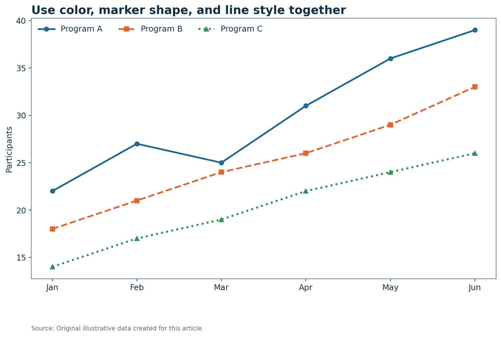 Accessible color and marker example. The three series remain different when color is unavailable because each also has a marker and line style.
Program A uses circles and a solid line. Program B uses squares and a dashed line. Program C uses triangles and a dotted line. All three rise over six months.
View data table alternative| Month | Program A | Program B | Program C |
|---|---|---|---|
| Jan | 22 | 18 | 14 |
| Feb | 27 | 21 | 17 |
| Mar | 25 | 24 | 19 |
| Apr | 31 | 26 | 22 |
| May | 36 | 29 | 24 |
| Jun | 39 | 33 | 26 |
Chart Accessibility
Accessible charts give the same key information in more than one form. A short alt text identifies the chart and its main message. A complex chart may also need a longer description and a data table. Color should never be the only cue. Interactive charts should support keyboard use, visible focus, zoom, and screen readers.
Alt text template
Chart type showing measure by group or time. State the main pattern, the highest or lowest value when important, and any major exception. Do not repeat every value when a data table already follows.
Long description template
Describe the chart structure, axes, units, series, main pattern, important values, unusual cases, uncertainty, and the location of the data table alternative.
<figure aria-labelledby="chart-title" aria-describedby="chart-desc">
  <img src="chart.png" alt="Line chart showing monthly water use peaking in August.">
  <figcaption>
    <strong id="chart-title">Household water use peaked in August</strong>
    <p id="chart-desc">Use fell during spring, rose through summer, and reached 372 litres in August.</p>
  </figcaption>
  <table>
    <caption>Monthly water use data</caption>
    <thead><tr><th scope="col">Month</th><th scope="col">Litres</th></tr></thead>
    <tbody><!-- data rows --></tbody>
  </table>
</figure>
For an accessible SVG, include a title and description, connect them with aria labels, and keep essential text in the document. The animation in the HTML file includes a reduced motion option and pauses when it leaves the viewport.
Static, Interactive, and Animated Charts
A static chart gives every reader the same view. It loads quickly, prints well, and works when one clear message can fit on the page. Static charts are often the best choice for articles, reports, and social posts because the reader does not need to discover controls before understanding the main result.
An interactive chart can help when readers need to filter groups, compare many periods, inspect exact values, or explore local detail. The interaction should solve a real task. It should not hide the headline finding behind a hover action or menu. Give users a useful first view, clear instructions, keyboard access, visible focus, and a text alternative that does not depend on the interaction.
Animation can explain change, sequence, or transformation. It can also distract, delay reading, or make comparison harder. Keep motion brief and calm. Avoid flashing. Let the final state remain long enough to read. Pause motion outside the viewport and respect the reduced motion setting. The animated hero in the HTML file is decorative, while every essential idea also appears in real text.
Data Storytelling Without Distortion
A chart tells a story by choosing what to show, what to compare, and where to guide attention. Good data storytelling begins with evidence. It does not begin with a slogan that the chart must prove. Write the question first, inspect the full data, then decide which result deserves emphasis.
Use a descriptive title that states what happened without claiming more than the data support. Add one or two annotations for important context, such as a policy change, missing period, or unusual event. Keep other marks quiet so the reader can see the message. Do not remove a category, shorten a period, or change a denominator merely because it weakens the preferred story.
A useful narrative also includes limits. Tell readers when values are estimated, rounded, adjusted, or based on a small sample. Explain when uncertainty overlaps or when a pattern may have several causes. A careful limitation does not weaken the chart. It helps the audience judge the evidence fairly.
Mobile and Responsive Chart Design
Many readers will see the article on a narrow screen. A chart that works on a large monitor may fail when labels shrink or a legend wraps. Test every figure at phone width. Prefer direct labels, short titles, fewer series, and horizontal bars for long category names. Keep important text away from image edges so social platforms do not crop it.
- Use responsive containers that preserve the chart aspect ratio.
- Allow wide tables to scroll without breaking the page.
- Keep chart text large enough to read without zooming.
- Place legends close to the data or replace them with direct labels.
- Do not require hover because touch screens do not have a stable hover state.
- Offer a data table and long description below complex figures.
Responsive design may require a different layout rather than a smaller copy of the desktop chart. A grouped chart may become small multiples. A wide legend may become direct labels. The goal is to preserve the comparison and meaning, not every decorative detail.
Misleading Charts and Graphs
A chart can mislead through scale, missing context, decoration, or selective data. The problem may be intentional or accidental. Readers should check how the display was built before trusting the first visual impression.
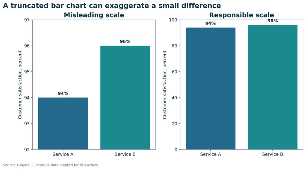 Misleading axis before and after. Both charts show a two point difference, but only the zero baseline preserves the meaning of bar length.
The left chart uses an axis from ninety two to ninety seven, making the second bar appear several times taller. The right chart uses zero to one hundred, showing that the difference is small.
View data table alternative| Service | Satisfaction, percent |
|---|---|
| Service A | 94 |
| Service B | 96 |
| Problem | Why it misleads | Better approach |
|---|---|---|
| Truncated bar axis | Bar length exaggerates a small difference | Start the value axis at zero or use a dot plot |
| Unequal intervals | Equal spaces represent unequal amounts of time or value | Use regular intervals or clearly show the gap |
| Reversed axis | Direction is easy to misread | Use normal order unless there is a strong convention |
| Three dimensional bars | Perspective changes apparent size | Use flat two dimensional marks |
| Cherry picked period | The selected window hides earlier or later movement | Show a relevant period and explain the choice |
| Missing categories | The chart changes the apparent total or ranking | Include all relevant groups or state the filter |
| Dual axes | Two scales can create a false visual link | Use separate panels or direct standardization |
| Oversized bubbles | Radius is mapped to value instead of area | Map area to magnitude and label key values |
| Percentages without sample size | A small group can look as stable as a large group | Show the count or sample size |
| Causal title for association | The wording goes beyond the design | Use linked with or associated with unless causation is supported |
Should Every Chart Start at Zero?
Bar and column charts normally need a zero baseline because the reader compares length. Starting above zero changes the meaning of that length. A dot plot can be a better choice when values are close and the exact difference matters.
Line charts do not always need to begin at zero because the reader often follows position and change rather than bar length. A restricted scale can reveal meaningful variation, but it must be clear, visible, and supported by context. Never hide an axis break or choose a range only to make a small movement appear dramatic.
Charts Versus Tables
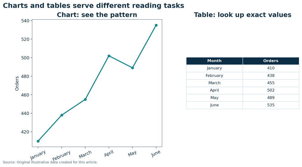 Chart versus table. Use a chart for fast pattern recognition and a table for exact lookup.
The line chart shows an overall rise with a small fall in May. The table lists the exact monthly totals from four hundred ten in January to five hundred thirty five in June.
View data table alternative| Month | Orders |
|---|---|
| January | 410 |
| February | 438 |
| March | 455 |
| April | 502 |
| May | 489 |
| June | 535 |
| Need | Chart | Table |
|---|---|---|
| See a pattern quickly | Strong choice | Possible but slower |
| Read exact values | Possible with labels | Strong choice |
| Compare many detailed records | Often crowded | Strong choice |
| Show a trend or relationship | Strong choice | Harder to see |
| Support audit or lookup | Useful summary | Strong choice |
| Provide an accessibility alternative | Needs text support | Strong choice |
Many reports should include both. The chart gives the main pattern. The table supports exact lookup and accessibility. Keep the two displays consistent and state when values are rounded.
How to Read a Chart Step by Step
How to Create Charts in Excel
|
1 |
Read the title Identify the subject and the claim the chart is making. |
|
2 |
Find the variables Ask what each axis, bar, point, line, or area represents. |
|
3 |
Check units Look for counts, percentages, minutes, currency, or rates. |
|
4 |
Inspect the scale Check the baseline, interval size, and any missing ranges. |
|
5 |
Read the legend Match colors, shapes, patterns, or lines to the correct group. |
|
6 |
Find the main pattern Look for ranking, change, clusters, spread, and exceptions. |
|
7 |
Review context Check source, sample size, period, filters, and uncertainty. |
|
8 |
Ask what is missing Consider unshown groups, causes, denominators, and limitations. |
- Place clean data in rows and columns with clear headers.
- Select the data range.
- Choose Insert, then review Recommended Charts or select a chart family.
- Confirm that the chart matches the question and variable type.
- Add a descriptive title, axis titles, and units.
- Edit the legend and remove elements that do not help.
- Check the baseline, intervals, and category order.
- Add alt text and run the accessibility checker.
- Export at a size that keeps labels readable.
Excel menus can differ by version and device. A recommended chart is only a starting point. The author still needs to check whether the scale, labels, and chart family fit the question.
How to Create Charts in Google Sheets
- Select the data range in the sheet.
- Choose Insert, then Chart.
- Use Setup to choose the chart type and confirm the data range.
- Use Customize to add titles, axis labels, legend settings, and data labels.
- Check the value axis and category order.
- Add notes or error bars when the chart needs them.
- Download or publish the chart only after checking readability and accessibility.
Menu wording may change over time. Use the official help pages for the exact interface on your device.
How to Create Charts in R
The following original code uses one small dataset and the ggplot2 grammar. It maps variables to visual properties, adds a geometric layer, writes labels, applies a clear theme, and saves the result.
library(ggplot2)

visits <- data.frame(
  branch = c("Riverside", "North Point", "Cedar Park", "Market Hall"),
  weekly_visits = c(1280, 1125, 980, 845)
)

ggplot(visits, aes(x = reorder(branch, weekly_visits), y = weekly_visits)) +
  geom_col() +
  coord_flip() +
  labs(
    title = "Riverside library received the most weekly visits",
    x = "Library branch",
    y = "Average weekly visits",
    caption = "Source: Original illustrative data"
  ) +
  theme_minimal(base_size = 12)

ggsave("library_visits.png", width = 9, height = 5.5, dpi = 180)
Use geom_histogram for a histogram, geom_line with geom_point for a time series, geom_point for a scatter plot, and geom_boxplot for grouped distributions. Check the bin width, group mapping, axis limits, and labels before saving.
How to Create Charts in Python
This original Python example uses pandas and Matplotlib. It sets the figure size, labels the axes, writes a source note, and saves a readable image.
import pandas as pd
import matplotlib.pyplot as plt

visits = pd.DataFrame({
    "branch": ["Riverside", "North Point", "Cedar Park", "Market Hall"],
    "weekly_visits": [1280, 1125, 980, 845]
}).sort_values("weekly_visits")

fig, ax = plt.subplots(figsize=(9, 5.5))
ax.barh(visits["branch"], visits["weekly_visits"])
ax.set_title("Riverside library received the most weekly visits", loc="left")
ax.set_xlabel("Average weekly visits")
ax.set_ylabel("Library branch")
ax.text(0, -0.18, "Source: Original illustrative data", transform=ax.transAxes)
fig.tight_layout()
fig.savefig("library_visits.png", dpi=180, bbox_inches="tight")
Use hist for a histogram, plot for a line chart, scatter for a relationship, and boxplot for grouped distributions. Add direct labels or a legend when needed. Save at a resolution that keeps text sharp in the final layout.
How to Report and Caption a Chart
A useful caption explains what is shown, who or what was measured, the period, the unit, the main finding, and any important limitation. It should add meaning rather than repeat the title.
| Chart purpose | Caption template |
|---|---|
| Comparison | Figure X compares measure across groups for population and period. Group A is highest, while Group C is lowest. Values are illustrative. |
| Trend | Figure X shows measure from start period to end period. The value rises until month, then falls. The scale is unit. |
| Relationship | Figure X plots variable Y against variable X for number of observations. The pattern is positive, but the chart does not prove causation. |
| Distribution | Figure X shows the distribution of variable for sample. Most values fall between range, with a longer tail toward direction. |
| Uncertainty | Figure X shows estimates with stated interval type. Wider ranges indicate lower precision. |
Real World Applications
| Field | Question | Useful chart |
|---|---|---|
| Healthcare | How long do patients wait? | Histogram and box plot |
| Education | Which learning method has the highest mean score? | Dot and range chart |
| Finance | How did revenue change by month? | Line chart |
| Manufacturing | Is the process stable? | Control chart |
| Marketing | Which channel produced the most conversions? | Bar chart |
| Public policy | Which district has the highest rate? | Map and ranked bar chart |
| Environmental science | How did water use change through the year? | Line chart |
| Journalism | How does a total divide into a few parts? | Stacked bar or limited pie chart |
| Sports | How do two performance measures relate? | Scatter plot |
| Customer experience | When do support requests peak? | Heatmap |
Common Chart Mistakes
| Myth | Fact |
|---|---|
| A more colorful chart is always better. | Color should carry meaning and remain restrained. |
| Three dimensional charts look more professional. | Perspective can distort size and make comparison harder. |
| A line can connect any categories. | Lines should connect ordered values where the path has meaning. |
| Every axis must start at zero. | Bar length needs zero, while line and dot charts may use a clear restricted range. |
| Pie charts are always wrong. | They can work for a few distinct parts of one clear whole. |
| A trend line proves causation. | It summarizes association only. |
| More labels always improve clarity. | Too many labels create clutter. |
| A chart replaces statistical analysis. | Charts guide interpretation but do not replace sound analysis. |
| Outliers should always be deleted. | First investigate whether they are errors, rare cases, or important signals. |
| An interactive chart is always better. | Interaction helps only when it supports a real user task. |
Chart Selection Checklist
- What question am I answering?
- What type of variables do I have?
- Is time or another order involved?
- Am I comparing, showing distribution, or studying association?
- Does the chart preserve accurate visual comparison?
- Are units and denominators clear?
- Is the scale honest and visible?
- Is uncertainty shown when it changes the conclusion?
- Can the chart be understood without color alone?
- Is there an accessible text alternative?
- Does the title state the message without exaggeration?
- Can a mobile reader understand it?
- Have I checked every value, label, and source note?
Frequently Asked Questions
What are charts and graphs in statistics?
They are visual displays that map data to bars, points, lines, areas, or symbols. They help people compare values, see patterns, understand distributions, and study relationships. A chart supports interpretation, but it does not replace the original data, study design, or statistical analysis.
What are the main types of charts?
Common chart types include bar charts, column charts, histograms, line charts, scatter plots, box plots, pie charts, dot plots, stacked bars, heatmaps, and maps. Specialized work may also use control charts, forest plots, ROC curves, Bland Altman plots, and other statistical graphics.
How do I choose the right chart?
Start with the question you need to answer. Use bars for category comparison, lines for ordered change, histograms or box plots for distributions, scatter plots for relationships, and stacked bars for composition. Then check data type, sample size, scale, audience, uncertainty, and accessibility.
Which chart is best for categorical data?
A bar chart is usually the clearest choice for counts, percentages, or summary values across categories. A dot plot can give a lighter display. A stacked bar can compare composition. A pie chart may work only when a few categories form one clear total.
Which chart is best for continuous data?
A histogram shows the overall distribution. A box plot summarizes median, quartiles, and potential outliers. A density or violin plot estimates shape. For a small sample, a dot plot or raw points can preserve more detail than a smooth summary.
Which chart shows trends over time?
A line chart is usually best when time is ordered and the goal is to see trend, seasonality, turning points, or rate of change. A column chart can work for a small number of periods. An area chart can emphasize accumulated volume but may feel visually heavier.
Which chart compares categories?
A horizontal bar chart is a strong default because bar length supports clear comparison and long labels fit well. A column chart works for a few short labels. A dot plot can be useful when values are close and a lighter design is preferred.
Which chart shows a relationship?
A scatter plot shows the relationship between two numerical variables. Each point represents one observation. Look for direction, strength, shape, clusters, and unusual points. A trend line can summarize a pattern, but the chart alone cannot establish cause.
What is the difference between a bar chart and histogram?
A bar chart compares separate categories, so bars usually have spaces and order may change. A histogram groups one numerical variable into connected intervals, so bars touch and follow the number scale. Histogram bin width also carries meaning.
When should I use a pie chart?
Use a pie chart when a few distinct categories add to one meaningful whole and the audience only needs a broad part to whole view. Avoid it when slices are many, similar, or need precise ranking. A sorted bar chart is often easier to compare.
What does a box plot show?
A box plot shows the median, the middle half of the values, whiskers, and possible outliers under a stated rule. It supports quick group comparison, but it can hide clusters and gaps. Add raw points when the sample is small.
What does a scatter plot show?
A scatter plot shows how two numerical variables vary together. An upward cloud suggests positive association, a downward cloud suggests negative association, and a diffuse cloud suggests little simple association. Curves and clusters may reveal patterns that a single correlation value misses.
Should a chart axis start at zero?
Bar and column chart value axes normally should start at zero because readers compare length. Line and dot charts may use a restricted range when the goal is to show meaningful variation. The scale must remain visible, justified, and free from hidden breaks.
What makes a graph misleading?
Common problems include a truncated bar axis, unequal intervals, missing categories, three dimensional perspective, cherry picked time ranges, dual axes, oversized bubbles, and percentages without sample size. A misleading title can also claim cause when the data only show association.
What is an accessible chart?
An accessible chart uses readable text, clear contrast, labels, and more than color alone. It includes short alt text, a longer description for complex content, and a data table when exact values matter. Interactive charts also need keyboard access, visible focus, and screen reader support.
How do I write alt text for a chart?
Name the chart type, measure, groups or period, and main pattern. Include the most important high, low, change, or exception. Keep the short alt text focused. Place detailed values in a long description or a table rather than forcing every number into one sentence.
How do I create a chart in Excel?
Arrange clean data with clear headers, select the range, choose Insert, and review Recommended Charts or a chosen chart family. Add a descriptive title, axis labels, units, and alt text. Check the baseline, order, legend, and readability before exporting.
How do I create a chart in Python?
Create a DataFrame or arrays, choose a Matplotlib or pandas plotting method, set the figure size, draw the chart, add a title and axis labels, state the source, and save at a suitable resolution. Review the scale, category order, and accessibility before publication.
What is the difference between a chart and a table?
A chart helps readers see patterns, trends, relationships, and rankings quickly. A table helps readers look up exact values and inspect many details. Many reports use both, with the chart for the main message and the table for precision and accessibility.
Can charts prove causation?
No. A chart can show an association, pattern, or group difference. Causal conclusions require a suitable design, strong assumptions, and supporting analysis. Randomized studies can support stronger causal claims than simple observational charts, but the conclusion still needs careful interpretation.
Conclusion
The main types of charts and graphs become easier to choose when you begin with the question. Use bar charts to compare categories, histograms to show numerical distributions, line charts to show ordered change, scatter plots to study relationships, and box plots to compare grouped distributions. Use pie charts only for a small and clear part of a whole.
Good labels, honest scales, meaningful color, source notes, uncertainty, and accessibility matter as much as chart type. A chart should clarify the data, not decorate or distort it. Choose one dataset, write the question you need to answer, then create two possible charts. Compare which one communicates the answer more clearly and responsibly.
References
- Numiqo Team. Charts and Diagrams: Visualizing Your Data Effectively. Accessed 19 July 2026. https://numiqo.com/tutorial/charts
- Statistics Canada. Data Visualization: Best Practices. Accessed 19 July 2026. https://www150.statcan.gc.ca/n1/pub/89-26-0005/892600052022001-eng.htm
- Office for National Statistics. Data visualisation guidance. Accessed 19 July 2026. https://service-manual.ons.gov.uk/data-visualisation/guidance
- World Wide Web Consortium. Complex Images, Web Accessibility Initiative. Accessed 19 July 2026. https://www.w3.org/WAI/tutorials/images/complex/
- World Wide Web Consortium. Understanding Use of Color. Accessed 19 July 2026. https://www.w3.org/WAI/WCAG21/Understanding/use-of-color.html
- Google Search Central. Creating Helpful, Reliable, People First Content. Accessed 19 July 2026. https://developers.google.com/search/docs/fundamentals/creating-helpful-content
- Tableau Help. Choose the Right Chart Type for Your Data. Accessed 19 July 2026. https://help.tableau.com/current/pro/desktop/en-us/what_chart_example.htm
- Penn State Statistics Online. Describing Data, Part 1. Accessed 19 July 2026. https://online.stat.psu.edu/stat200/lesson/2
- Microsoft Support. Create a chart from start to finish. Accessed 19 July 2026. https://support.microsoft.com/en-us/excel/get-started/create-a-chart-from-start-to-finish
- Google Docs Editors Help. Add and edit a chart or graph. Accessed 19 July 2026. https://support.google.com/docs/answer/63824?co=GENIE.Platform%3DDesktop&hl=en
- pandas documentation. DataFrame.plot. Accessed 19 July 2026. https://pandas.pydata.org/docs/reference/api/pandas.DataFrame.plot.html
- Matplotlib documentation. matplotlib.pyplot.hist. Accessed 19 July 2026. https://matplotlib.org/stable/api/_as_gen/matplotlib.pyplot.hist.html
- ggplot2 documentation. Package index. Accessed 19 July 2026. https://ggplot2.tidyverse.org/reference/index.html
- SciPy documentation. scipy.stats.probplot. Accessed 19 July 2026. https://docs.scipy.org/doc/scipy/reference/generated/scipy.stats.probplot.html